 FA+
FA+
392
Views
Views
4
Favorites
Favorites
Category
Artwork (Digital) / Portraits
Species Dog (Other)
Size 831 x 542
File Size 105.4 kB
Report this content
More from Aurifer


")


(#0078)
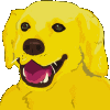
Final version. (OR IS IT?)
I ended up generating a simple palette, and I used that to swap out colours. Hooray for keyboard shortcuts!
The end result: Something that I can actually use.
It started off as a regular sort of pencil sketch, but with colours and my custom paint brush, so most of the head is only lines. When I got to the nose, I ended up filling in the whole thing, then layered a few other colours on top, and then dotted in the highlights. It popped out like a real painting, and I was amazed. I think the next one I do would be a real painting (but fake, because it's on the computer), where I use colour across the entire canvas.
Overall, I've gotten better. The squishy side is squished a bit (left side? Right side? Is that me looking in a mirror, or is that me from the viewpoint of someone else?) and the torso didn't come out very well, but.
The proportions are much better. I'm happy.
Category Artwork (Digital) / Portraits
Species Dog (Other)
Size 831 x 542px
File Size 105.4 kB
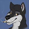
I agree, this is much better, Awesome work! :) Your first re-creation I didn't quite want to comment on, as when shrunk down as an icon looked kinda... Creepy lol, but then again I think it was also due to the empty eye sockets, Comparing the Old/Original to first re-created New I liked your original avatar much better. ;)
But with this one, with the colors, plus the black eyes, definitely looks much better. :) Great job!
But with this one, with the colors, plus the black eyes, definitely looks much better. :) Great job!
Yeah, I looked like a villain from a Batman comic.
I swear, the way my memory works, I need to take constant refresher courses on everything. It usually takes me two or three tries to draw something half-decent. I only realized halfway through that I could do a full painting.
I was experimenting with art media layers in Paint Shop Pro 9, but for some reason it does a lot of drive activity and has latency issues.

Comments