 FA+
FA+
352
Views
Views
13
Favorites
Favorites
Category
Artwork (Traditional) / Doodle
Species Panda
Size 700 x 785
File Size 429.8 kB
Report this content
More from Spix


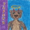
Alright, so I was experimenting with that whole shading with funky colours business. It didn't turn out like I wanted, but I'd still like to finish this piece up. I think that with the right background, this picture won't look so wonky. SO, anyone who wants to, let's hear some input on what kind of a background would help this shading look not so out of place!
I'm looking at you, akagen
Time: 1.5 hours to colour
Tools used: Copics - 100, C1, C3, C7, B14, G16, YR04, YR07, R27, V06 and V09. Neopiko Y476.
I'm looking at you,
 akagen
Time: 1.5 hours to colour
Tools used: Copics - 100, C1, C3, C7, B14, G16, YR04, YR07, R27, V06 and V09. Neopiko Y476.
Category Artwork (Traditional) / Doodle
Species Panda
Size 700 x 785px
File Size 429.8 kB


I personally like how the color/shading looks. If you really want a background, I have a couple ideas :/
- Leafy green shrubbery and trees. The green will make the figure pop out, but maybe too much so.
- Simple, snow-like background. Simple gray shading to make it look like there is a snow drift, and maybe some trees in the background.
- Leafy green shrubbery and trees. The green will make the figure pop out, but maybe too much so.
- Simple, snow-like background. Simple gray shading to make it look like there is a snow drift, and maybe some trees in the background.


Comments