 FA+
FA+
1151
Views
Views
78
Favorites
Favorites
Category
Artwork (Digital) / Doodle
Species Housecat
Size 595 x 842
File Size 111.4 kB
Report this content
More from thefunkyone


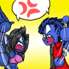
Something I'm working on at the moment. This is technically my fourth attempt at this image, for first try being sometime in 2003 I think.
My current problem is getting the setting and angle right. They're supposed to be falling, as if Violet has just kicked Felicia out of a window and leapt after her. Trouble is I can't get a solid idea of where they are (maybe a warehouse?) and what angle the shot should be at to give a good sense of what's going on.
Any ideas? Or good references? Crits on the posing is welcome too.
Category Artwork (Digital) / Doodle
Species Housecat
Size 595 x 842px
File Size 111.4 kB

I like this angle. It's very dynamic and everything. But i think that, if you wanna show they are falling out of a window, you either need to show some street and stuff below if they are falling out of a city building from pretty high up...OR if they are flying out of some warehouse window, perhaps you should try an angle from the viewer's POV as if they were below and could see the warehouse and them bursting from the window.


jaw... is dropped. The comment directly above mine if it were Big Ben would be completely epic as all holy hell. That would be a helluva finale for a movie no doubt because at that point, nothing would be able to top it. Two ninjas just burst through the front of a national monument and are battling it out even on their way to the ground.... Crowd spills popcorn EVERYWHERE!!!

I've read a lot of how to draw comic books stuff and I think the posing and positioning is actually nicely done :3 It's not boring at all from the posing and the positioning is just right to make it awesome.
Now another idea is the same pose but have the camera over the shoulder of the one who is falling looking up to the kitty with the swords. But this one is very nicely done. :3
Now another idea is the same pose but have the camera over the shoulder of the one who is falling looking up to the kitty with the swords. But this one is very nicely done. :3

Fun posing. Cool perspective. The guy in the foreground is excellent. Watch that foreshortening .
The arm closest to the camera is off model. You can either thicken the male's screen-left arm and shorten the sword if they're both of equal length. Or, you can buff up the arm to match the foreshortening shown in the size of the fists. In this case, the closest sword should be longer. Remember to compare the length of the limbs between both characters as well.. currently the screen-left bicep is smaller than the female's bicep and she's farther away.
Finally, watch out for the silhouette. Where the line of the female's leg gets hidden behind the male's leg. If you were to fill the characters with nothing but black, the bottom of the guy's thigh would flow right into the bottom of the girl's silhouette. I'd suggest moving her hidden leg so the silhouette helps add to the direction and motion of falling. I can see that you've hinted at her leg and toe in the image too, however they would read more as accessories on the male than her leg and foot. That's not necessarily bad since it's a cover image, not an animation frame; it's just that it can be improved. :)
Good stuff!
Thanks very much for the feedback!
I do feel that I should clarify one thing though; the character on the left, Violet, is a female too. I'll blame the difficult angle and my lack of ability to draw it for that confusion.
Anyway, back to the feedback. Foreshortening is something I'm still working on - I figured it still wasn't quite right on this one, so thickening up the arm would certainly help. I'll lengthen that sword as well since the blade itself should actually be twice the length of the handle, which is isn't here. Thanks for pointing out the bicep size as well, I hadn't caught that one.
Now, the overall silhouette is something I'm having a little trouble with generally. I may have to move both characters further apart from each other to stop them merging. Actually, that may work out much better for the implied distances between them. It would probably move the vanishing point as well, but that's probably a good thing. I'm not entirely comfortable with where it is right now.
I'm just playing about with it a bit more now to see how it turns out.
Thanks very much for the critique, it's been very useful!
Not a problem. I don't think you should separate their silhouettes from each other though. Even a slight overlap, such as the knee overlapping any part of the bottom girl's body really drives the emotion. (It helps to imply a sense of urgency and domination over the other) The distance between characters can be accentuated by scaling down the girl farther away from the camera. Since the characters aren't touching, you would better serve the feel by keeping the foreshortening minimal on the limbs of the characters except when the pose really demands it (limbs pointing directly towards/away from camera). Keeping the silhouettes easily readable and the size relations between characters apparent will create the depth you need. Especially with the powerful posing you have.
Actually, got a quick redline suggestion and the silhouette (uncorrected; to illustrate things to look out for) to show you what I mean. I didn't change Violet's foreshortening or previous model issues...
Altered Line only
Silhouette only
Red Line with suggestions
Silhouette and Red Line
Also, do feel free to ignore any suggestions.. I enjoy critiquing pieces I like. :D
Sorry for taking all week to get back to ya.
Huge thanks for the redlines and silhouettes there, they really helped point out a lot of the flaws in this one! Most of them I hadn't caught, but there were some I just hadn't even considered, so it was definitely useful :)
When I said I'd separate the characters I didn't mean completely. I want to keep that sense of one dominating the other like you mentioned, so it would just be a slight move to space them out a little better. I've scaled down Felicia (further away) a little and I'm working on fixing that leg and her overall silhouette. That arm seems to be something a few have picked up on so I'll see about changing that up a bit to make it look less awkward. I'm also trying to fix the anatomy errors. I'm sure I won't get them all, but again, the redline certainly helped point out where I'm going wrong here.
So yes! Thanks very much for the help here!


Truly very good. I think that beginning to flesh out the background into familiar scenes along your perspective lines would help the imaginative process out. You could go as far as trying a fisheye effect if there is more to the scenery you wished to communicate.
To me, I imagine (based on your description) seeing a small part of the window ledge (ie: office building style floor to ceiling glass panels) and a view of an alley and/or street intersection (a "T" intersection). Seems like the continuous street would run at the 120 degree angle and the dead-ended street would run at the 60* angle.
That's just what pops into my head, but I think if you make a transparency or separate layer using a light box (or those programs) for background experimentation you'll arrive at your destination without the hassle of of a bunch of erasing.

Of course, a foreground and background would really help establish the visual story of the shot, but I think there are some things you could do besides those. TBH at first glance I got more a feeling of worm's-eye-view of a normally oriented fight than a view of characters falling out of a window.
The angle of the glass shards. You've done a good job of making the broken glass pieces feel distinct and individual, but it might help with the feeling that everything is falling if their long axis is is aligned with the direction of gravity - as if they're pointing down, leading the eye. Motion lines can't hurt, of course, everyone's favorite shortcut to creating a sense of motion.
There's visual memes around air resistance that I think you could exploit further. The lighter the objects are, the more they point backwards towards where they're falling from. Violet's hair and tail look to me like they're at a sort of non-committal 45 degrees, which doesn't tell a story of motion any more than they would if she were making a forward attack while standing on solid ground. Felicia's tail heads "up" (away from the ground) at first, but then starts to turn away at the floofiest end-part, which doesn't give the impression of air rushing past/falling. It would help if Violet's hair and both their tails all more blatantly headed in the same direction; it would help even more if this direction completely follows the wind rushing past them -- that which would be formed by an arrow pointing straight up from the ground and going through Felicia and then Violet's centers of mass. Right now all the dangly bits are heading halfway between A) that same imaginary arrow pointing to the northwest corner of the frame and B) where they would be falling if they were fighting normally on level ground, pointing to the southwest corner of the frame. This is muddying the visual story that you're trying to convey. In the same vein, the satchel on Violet's back seems to be dangly, but it's tightly up against her back, again as if she were just standing on solid ground in a normal orientation. To show that everyone's in free-fall, it would help if the satchel, hair, tails, etc are sort of floating away, in the direction of that imaginary arrow, towards the northwest corner.
The perspective and foreshortening are good to my eye, and I do get a sense of motion and action; I can't think of anything I'd change. The poses, same story, when considered individually -- but you might want to consider refactoring something in the area of "blocking" as they say in theatre: Violet's going to block the audience's view of Felicia's right leg, and that's going to cut out a little bit of the visual story that we can see in the sketch. It looks like she's kicking here, but that info will be lost when when the image is done. The overall composition is great, besides this blocking problem, so maybe just bring Felicia's leg a little lower so that some of her shin can be seen between Violet's legs?
It's cool to see you working on White Shadow, and it's cool that you're asking for crits after sketching. So many times around here, people post a finished piece and ask for crits and I'm like, well, how many of these things that look off to me, that would have previously been quick fixes, should I mention ...
Thanks very much for the critique here :D (sorry for replying late)
The perspective issue is understandable, it really doesn't help that there's not a background in there. It did highlight a few problems with the characters' posing though, as you've pointed out. There's also the opposite motion on the clothes and hair - it's something I'm well aware of as a rule but didn't seem to apply correctly in this one. It's something I need to practice much more I think. I don't do it enough.
The satchel on Violet's back was also a good thing to point out. I wouldn't have properly considered that one beforehand. Drawing it correctly is another matter, but I think part of it comes down to how it's attached to the belt and sword sheaths, so in theory they should only be able to move about as far as the sheaths themselves can. Not saying I drew it right, of course, so it's something I should take a look at a bit more.
I've fixed the blocking issue between the two of them, so I'll post up a new version once I fix the rest of the issues. It seems to be reading much better overall though.
Thanks again for the crit, here! It's always great to get another opinion on how things are going before I finalise them. It sucks to realise there's a bunch of mistakes after it's too late to do anything about them. You guys always seem to give great crits on these WIP posts :)


I'd move the right character up a bit up, so her leg intersects more with the one in the front.
The setting reminded me of Tron! :D
I think it would be cool to have an abstract simplistic digital surrounding.
Tron concept art:
http://blaquesabers.posterous.com/t.....ou-inside-cybe
The setting reminded me of Tron! :D
I think it would be cool to have an abstract simplistic digital surrounding.
Tron concept art:
http://blaquesabers.posterous.com/t.....ou-inside-cybe

Have them falling through Kowloon Walled City.
http://www.architakes.com/wp-conten.....y-triptych.jpg
Because Kowloon was dystopic awesome.
http://www.architakes.com/wp-conten.....y-triptych.jpg
Because Kowloon was dystopic awesome.


maybe its just my weirdness but i love these kinds of scenes in movies where people keep fighting while they fall trying to reverse it on one another so someone takes the brunt of the impact
felicias leg thats under violet looks a bit over extended now i know in a more finished version that wouldnt be seen but in sketch form it looks wierd
and with that violets right thigh looks rather thick now im not sure if its the angle or if im mixing up lines from felicia but it looks wider then her abdomen somehow
Comments