 FA+
FA+
597
Views
Views
28
Favorites
Favorites
Category
Artwork (Digital) / Tutorials
Species Western Dragon
Size 1200 x 800
File Size 743.9 kB
Report this content
More from Slate_D
")
")
")


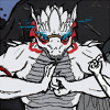
Alright... this took me way to long to finish, and only part of it was do to getting side tracked. I'm still pretty unsatisfied with it, but fuck it, I wanted to be done with it XC
Oh well, despite how bad it is, I now have a proper reference. The only thing I like about this is the snarling head in the middle.
I was even too lazy to redraw the sword. Instead, I just cut and pasted it from the pick I did in January. On a side note, that is it's actual size relative to the front and back views.
Anyway, that's about it.
Art & Character © K.T.H. ( Slate_D)
Oh well, despite how bad it is, I now have a proper reference. The only thing I like about this is the snarling head in the middle.
I was even too lazy to redraw the sword. Instead, I just cut and pasted it from the pick I did in January. On a side note, that is it's actual size relative to the front and back views.
Anyway, that's about it.
Art & Character © K.T.H. (
 Slate_D)
Category Artwork (Digital) / Tutorials
Species Western Dragon
Size 1200 x 800px
File Size 743.9 kB


You're welcome. Iksars have a long history with dragons, as they are our progenitors. I maybe like them too much - the attractiveness of the form distracts me from the being inside.
It takes quite a lot to put fear into an Iksar, as they serve a diety whose very name is meant to strike fear into non-believers. Yours is one such fearsome being.
(RP aside) It is hard to go beyond just attracting attention and attracting quality attention, especially the quality of attention we wanted, or even expected.
It must be extra burdensome for an artist. I applaud the bravery at continuing it.


FINALLY I'm here to comment
I think you did fantastic on the core shadow placements, they look really legit. I'm very fond of the leg and hand placements, especially the legs, but that's probably because those are the things I have the most trouble with.
I think the first one from the left is my favorite, just because it emits that presence of Slate. I also think that the painting in that one is the most consistent.
The snarling head looks a little bit static, but it keeps that presence of intelligence, and not some beast that could lose control at any second, like I usually go for, lol. As for the painting in that one, I think it's really great, but it feels like you used two totally different styles. But the lighting on it is superb.
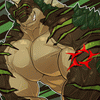
I really like the Slate on the far right too, I think back shots are really hard to draw, so great job. The only qualm with that one is the black hole, it looks really slapped on, but I have no idea how to fix that, because I imagine that's probably what a black hole would look like if it were on someone.
The information is very thorough, and I'm quite jealous to be honest, I really have to get off my ass and make myself a good one, only 4 weeks left of classes though!
I think you did fantastic on the core shadow placements, they look really legit. I'm very fond of the leg and hand placements, especially the legs, but that's probably because those are the things I have the most trouble with.
I think the first one from the left is my favorite, just because it emits that presence of Slate. I also think that the painting in that one is the most consistent.
The snarling head looks a little bit static, but it keeps that presence of intelligence, and not some beast that could lose control at any second, like I usually go for, lol. As for the painting in that one, I think it's really great, but it feels like you used two totally different styles. But the lighting on it is superb.
I really like the Slate on the far right too, I think back shots are really hard to draw, so great job. The only qualm with that one is the black hole, it looks really slapped on, but I have no idea how to fix that, because I imagine that's probably what a black hole would look like if it were on someone.
The information is very thorough, and I'm quite jealous to be honest, I really have to get off my ass and make myself a good one, only 4 weeks left of classes though!
This is the kind of comment I want! While all three were done in the same style, I should have spent more time on the middle. The way I draw is better suited for things like the front and back view, rather than 'close ups'. While I originally intended the snarling to be a fierce battle roar, it looks more like a 'SILENCE!' roar.
And it's more of an eclipse than a black hole. Wether it looks as though it's slapped on or not, it is as though I intended it to look.
And it's more of an eclipse than a black hole. Wether it looks as though it's slapped on or not, it is as though I intended it to look.
Comments