 FA+
FA+
1443
Views
Views
103
Favorites
Favorites
Category
Artwork (Traditional) / Fantasy
Species Dragon (Other)
Size 640 x 480
File Size 97.9 kB
Report this content
More from Thorphax


Listed in Folders


so yeah just to prove i am not being a slacker and just laying around XDDD
this was a texture project for college, metal texture from shining plates to rusted plates on the neck and a lil on the back.
6h of shading, * dies * X_X
oh and yeah its on a big piece of paper, if i come to needing to i might sell it... maybe XDDDD
shitty photo is shitty >_>
dragon and art © to
this was a texture project for college, metal texture from shining plates to rusted plates on the neck and a lil on the back.
6h of shading, * dies * X_X
oh and yeah its on a big piece of paper, if i come to needing to i might sell it... maybe XDDDD
shitty photo is shitty >_>
dragon and art © to

Category Artwork (Traditional) / Fantasy
Species Dragon (Other)
Size 640 x 480px
File Size 97.9 kB
Listed in Folders


When I saw this image im like "Oo more works of master" When it loads and at fist glance, I think its a Digita image, then I noticed the lighting and a Hand... My Jaw DROPED... I Clicked the +fav Button like 80 times... sadly, it didnt +fav it that many times, it just +,-,+,-,+,-,+,-,+,-,ect over and over.... j/k :B
Thats an amazing Job Master <3~~
Im an Extreamly mpressed <3
Thats an amazing Job Master <3~~
Im an Extreamly mpressed <3


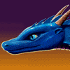


When it comes to shading I can do an eye that can pass a renal scanner. I've done self portraits where I've obsessed over every streak and black spot on the eyes and how the light passing through the iris at an angle was being affected by the dome of the shape of the lens and because I was using only one bulb for light the light was streaming through the lens of each eye at a slightly different angle. I spent Well Over six hours shading that self-portrait and a good portion of that was just shading the eyes.
This is fantastic work! I love it!
This is fantastic work! I love it!


I don't know what to say, this is fabulous, I never take the time to comment on anything on this site but man, allow me to risk getting told off for not doing my homework to comment on this,
First of all the shape of the head and structure you used for the simple posing is very dragon like, it's not the most original way but man you make up for that with the rest of the art, I'll hint on that later, there is nothing to confuse you and tel you it's not a dragon from this, this shape, the structure all screams dragon, not dinosaur not lizard, which is very well done considering Dragons have no real structure to go by and learn from.
The second thing I'd have to say is the placing of all the metal places, jsut like scales, very well done, but not just that it's in an interesting manner that's eye catching and the way you drew it is amazing, vey high-class work, the tonal work is lush, it just completely makes out metal, maybe a little too soft in points for metal? But other than that I see nothing wrong with the tonals if you carry on like that you'll be a star, the only thing left now is the practice, the best medicne, not that I see much at all wrong with it. I think I'm in love with it, so I may be bias in my judgement as this is like... a really good piece if I dare say. Well done, keep it up.
wow thank you for the awsome comment!! I worked hard on this pic and so far its one of my favorites, placed around 5h of shading ont hat and it was done in quite the big bristol board haha. i'm aiming in refining it more and framing it for my wall, but indeed sometimes i tend to do too soft of a shadding since i'm the more organic guy haha! but yup! practice and more rpactice brings it all together, and more shall come in the future!
thank you for liking a well! means i am in the right path :)
thank you for liking a well! means i am in the right path :)


Hey there. I got here from  I_Love_Critique
I agree with the general sentiment that this is really cool and you did a great job, but if you're interested in a critique, I'll give it a whirl. Really, its a great piece, so please take my comments as improvements upon an already solid work.
The shading definitely gives it a metallic look, but the shading is uniform across each of the pieces of a material type, ie the rusted portions are shaded the same, as are the teeth and plates on the face. Looking at something like this: http://www.flickr.com/photos/teamdroid/193710135/ will show that light source is critical in giving the appearance of metal. Each piece does have its own shading and it differs on material type, but there is an overall light source that really brings the image into the third dimension. Because this isn't there, the image appears flat and the teeth and eyes are difficult to distinguish at first from the rest of the head. The front of the neck should be in shadow being covered by the chin, which will make the chin stand out. Conversely, the bladed nose, the horns, and the brow should be reflecting the light source and appear lighter than say the hinge of the jaw.
I might also consider making use of different materials for things like teeth and horns than the skin. Maybe silver teeth and a more gunmetal skin tone.
I hope you find this helpful and constructive and not hypercritical :)
 I_Love_Critique
 I agree with the general sentiment that this is really cool and you did a great job, but if you're interested in a critique, I'll give it a whirl. Really, its a great piece, so please take my comments as improvements upon an already solid work.
The shading definitely gives it a metallic look, but the shading is uniform across each of the pieces of a material type, ie the rusted portions are shaded the same, as are the teeth and plates on the face. Looking at something like this: http://www.flickr.com/photos/teamdroid/193710135/ will show that light source is critical in giving the appearance of metal. Each piece does have its own shading and it differs on material type, but there is an overall light source that really brings the image into the third dimension. Because this isn't there, the image appears flat and the teeth and eyes are difficult to distinguish at first from the rest of the head. The front of the neck should be in shadow being covered by the chin, which will make the chin stand out. Conversely, the bladed nose, the horns, and the brow should be reflecting the light source and appear lighter than say the hinge of the jaw.
I might also consider making use of different materials for things like teeth and horns than the skin. Maybe silver teeth and a more gunmetal skin tone.
I hope you find this helpful and constructive and not hypercritical :)

Comments