 FA+
FA+
285
Views
Views
12
Favorites
Favorites
Category
Artwork (Digital) / All
Species Unspecified / Any
Size 800 x 649
File Size 53.2 kB
Report this content
★
More from JTigerclaw


Listed in Folders

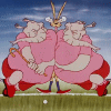
Bradford Bantams FBA logo!
This is the redesigned logo for the FBA team, the Bradford Bantams. They kind of already had a logo ( http://www.furaffinity.net/view/2984821/ ), but I've been wanting to make my version of it... and I had to make it for a picture I did featuring the Bantams' newest additions to the roster! Necessity is the mother of ... forcing me to do art! ;)
It is my goal to create or improve a logo for every team in the FBA eventually... all 24 of them. The Thrust I think might be the only exception, because they have a great logo, but every other logo, including the two I've done already, will be done to match this kind of quality. Oh, and I want to make front and back jerseys for each team too. Yeah, that might take a while.
FBA © buckhopper Go check his page out and experience the wonder of furry basketball. ^__^
It is my goal to create or improve a logo for every team in the FBA eventually... all 24 of them. The Thrust I think might be the only exception, because they have a great logo, but every other logo, including the two I've done already, will be done to match this kind of quality. Oh, and I want to make front and back jerseys for each team too. Yeah, that might take a while.
FBA ©
 buckhopper Go check his page out and experience the wonder of furry basketball. ^__^
Category Artwork (Digital) / All
Species Unspecified / Any
Size 800 x 649px
File Size 53.2 kB


If I did anything with the Thrust logo, it would be very basic tweaking, like making the jagged burst thing behind the letters smoother and more dynamic. But I really like the logo how it is as well, and it works great for the jerseys.
The Sand Dollars one, as you know, has a total new redesign in the works. The Howlers I like, but I might try to change the font. I'm not sure if I will though. I like the way the rest of the logo looks.
And you're very right! The two logos I examined as reference to this picture were the Dallas Mavericks and the Sacramento Kings. ^____^

When are the Rabble changing to the Royals again? 2011? I do intend to make logos for everyone, including the Rabble, but there's not telling when I'll get the time to go through the whole list. They could be the Royals again by the time I get around to it.
Basketball with a crown on top... you mean like... er... what I just did for the Bantams? Uh oh... hmmmm.....
Basketball with a crown on top... you mean like... er... what I just did for the Bantams? Uh oh... hmmmm.....

I used yours for inspiration and tried to use the creative direction you were going with. I just wanted to try my hand at making it look more like a professional sports logo.
I hope you don't take offense. There was nothing wrong with your logo really. I just wanted to try making the version in my head. :)
I hope you don't take offense. There was nothing wrong with your logo really. I just wanted to try making the version in my head. :)
Comments