 FA+
FA+
852
Views
Views
49
Favorites
Favorites
Category
Artwork (Digital) / General Furry Art
Species Lion
Size 500 x 500
File Size 213.8 kB
Report this content
★
More from Jocarra


Listed in Folders

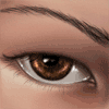
Another port commission, this time of a particularly cool fellow named Merkabah, a resurrected mage of sorts with a construct body. He's giving you a "I see what you did there!" look, it would seem ;P
~4 hours Adobe Photoshop CS3.
~4 hours Adobe Photoshop CS3.
Category Artwork (Digital) / General Furry Art
Species Lion
Size 500 x 500px
File Size 213.8 kB


This pic is beautiful but there are a few things that could be improved. You need to maybe deepen the shadows around contours, such as the pecs and arm muscles, also, the horns do not look as solid and real at the rest of the image. the blue mane is cool, but it two suffers in realism. Blue is an extremely unnatural color for har or fur as it is so it becomes really important to push up the other things that make it look real a notch. Deeper shadows, perhaps desaturated the color a slight bit to match the lighting of the rest of the image.
(I know, it's like OMG a real crit on FA? Blastphemy!" And you will either hate me or like me for it but hey, I do like this enough to fave it so hopefully this doesn't totally offend you. Just some thoughts.)
Peace mate. keep doing what you do.
(I know, it's like OMG a real crit on FA? Blastphemy!" And you will either hate me or like me for it but hey, I do like this enough to fave it so hopefully this doesn't totally offend you. Just some thoughts.)
Peace mate. keep doing what you do.
XD Nah, I appreciate it, no worries.
Yeah, it didn't seem to look quite right with the deeper shadows, although I definitely considered that. The character is supposed to be magical and "pristine white" so anything else to me seemed too grey, or too blue X3 And the mane was supposed to be a kind of startling, super deep indigo blue, so again it felt not quite right to desaturate the colour at all.
When I started working on the mane, I realised this wasn't a piece that I could easily get to look photorealistic like some others, and settled for more a pseudo-realistic style. But yeah, I pretty much agree with you on all your critiques - I just wasn't sure what to do to fix them, y'know? But I'm still happy with him, but simply because I think he's a neat character that I'm happy to have brought some life to, and not because he's my best piece or my most realistic.
But yeah, thanks :)


Comments