 FA+
FA+
277
Views
Views
1
Favorites
Favorites
Category
Artwork (Traditional) / Comics
Species Unspecified / Any
Size 1127 x 380
File Size 230.6 kB
Report this content
More from Zerulu


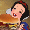
It's totally true, I was there. Saw it with my own face.
Ok I am kind of just putting around here, so bare with me (or is it bear with me?). I don't like how the images on this turned out in comparison to the ones I submitted previously. Something to work on: Consistency! (quality...)
I'm debating whether or not I should continue using my own hand writing. I can read it, but I think it might come off as too sloppy? I want a more organic feel, though.
Critique is dandy.
Category Artwork (Traditional) / Comics
Species Unspecified / Any
Size 1127 x 380px
File Size 230.6 kB

Most people who do comics the traditional way tend to use their own hand-writing. But that's often only when the text is bold or caps, normally both. When people who are good at using their own hand-writing, they particularly have great consistency in the shape of the letters and in keeping their text on an invisible, straight, horizontal line.
With this little piece, when I read the handwriting I instantly noticed that it's on a horizontally wavy line. This happens to me sometimes when I do hand-writing without guidelines, where my sentence begins to slant downwards or upwards and I begin to try correcting this by making a slow transition back onto the flat line. As for the consistency of the letters' shapes, I'll use an example. (This is only something I notice if I focus directly on the text.)
The T in the first panel isn't curved like it is in the second panel. Then in the third panel, the T is curved, but not so noticably as the one in the second panel.
Personal complaint:
Eww, Dot nose.
Comments