 FA+
FA+
573
Views
Views
29
Favorites
Favorites
Category
Artwork (Digital) / General Furry Art
Species Vulpine (Other)
Size 1280 x 853
File Size 558.9 kB
Report this content
More from FlintXD


Listed in Folders


Since my exams I've been lazing around a lot.... Hey, I'm entitled to it! X3
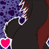
Been feeling my arts not progressing very well on a few levels so i needed to do a piccy and try out a few things:
1: Fluffy effect - I drew a piccy just before my exams and murdered it because I couldnt get a nice fluffy fur effect. This Is much better and closer to what I want. The chest fur and chin annoyed me most but its good to me ^^
2: Face - I feel like I've gotten weaker in drawing heads a faces so I looked at different artists' styles whose are similar to mine and referenced from them. I felt better doing that with this picture. Its not quite where I want it but its going in the right direction.
3: Hair - Always struggled to get the hair pattern I like. Shading is no problem for me on it, just positioning the hair is hard, but this is better.
4: Inking - Ive gone back to a thicker lineart. It just feels more comfortable and a nicer feeling. Also, I didnt use a white background while I inked. I read somewhere using a soft colour in the background whilst inking and sketching isnt as hard on the eyes. It works too!
5: Anatomy - This is forever ongoing! Though I think I did well with this one. Only the chest/torso connection doesnt quite look right but nonetheless, I got a nice belly from it ^^
6: Backgrounds - I will never do a stunning background. This is as best as I can get it. I really like it. Only part I forgot to do was add in wrinkled/squash effects from where im layin on the basket.
Category Artwork (Digital) / General Furry Art
Species Vulpine (Other)
Size 1280 x 853px
File Size 558.9 kB
Listed in Folders


Comments