 FA+
FA+


1820 submissions
")


Educate Yourself With Bruce And Roos: Word Balloon Order
Okay so it turns out my biggest pet peeve with amateur comics is people not knowing what proper reading order for word balloons is. You can’t just put them wherever is most convenient for the rest of the picture, unfortunately.
Naturally, this applies to English, manga has its reading priority facing the top-right of the panel instead, and tends to finish columns before continuing rows, on account of the native top-bottom right-left writing direction. (Though they still group panels into rows instead of columns, mind)
Naturally, this applies to English, manga has its reading priority facing the top-right of the panel instead, and tends to finish columns before continuing rows, on account of the native top-bottom right-left writing direction. (Though they still group panels into rows instead of columns, mind)
Category Artwork (Digital) / Comics
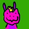
Species Kangaroo
Size 853 x 1280px
File Size 337.9 kB


Like the dubs vs subs, there's two camps. A lot of manga released by western publishing houses will have art mirrored or altered to make it flow in a familiar left-right style associated with most European languages. Fan translations and imports tend to maintain the original right-left layout.

That sounds like Prisoner of Punch by  TakaTaka. He has that announcement at the top of the comic.
 TakaTaka. He has that announcement at the top of the comic.


Eh... I find Panels 2 and 4 to be completely unambiguous as well, and also seem to complement the flow of each other better, due to the composition and context of the bubbles. "Stacked Bubbles' work when the two are being wordy, but, as seen in Panel 3, it creates an eyesore of a "Wall of Text" (Which works, if the content of the panel is to focus more on the words than the characters). Meanwhile, Panel 4's makes it clear who's speaking with the crossed tails, but it also gives a sense of urgency/interruption to the second speaker, and a sense of active 'sides'.Two people having a conversation? Go with panel #3. Two people in a verbal conflict (That may or may not be accompanying a physical one)? Panel #4 is the better layout.
In panel 2, the topmost bubble is always read first, especially if it horizontally overlaps part of the left-most panel (The reader first sees the left-most bubble, but immediately sees the top one as 'read first' before reading the text of the left-most bubble. It's a great space to put short text - such as a 'cut-off' speaker, or someone talking about something not immediately relevant. Essentially, the priority conflict there gives a sense of being 'talked over' - yeah, Top Bubble Speaker was talking first, but what he has to say isn't as important as what Left Bubble Speaker's saying.)
In panel 2, the topmost bubble is always read first, especially if it horizontally overlaps part of the left-most panel (The reader first sees the left-most bubble, but immediately sees the top one as 'read first' before reading the text of the left-most bubble. It's a great space to put short text - such as a 'cut-off' speaker, or someone talking about something not immediately relevant. Essentially, the priority conflict there gives a sense of being 'talked over' - yeah, Top Bubble Speaker was talking first, but what he has to say isn't as important as what Left Bubble Speaker's saying.)

"In panel 2, the topmost bubble is always read first, especially if it horizontally overlaps part of the left-most panel."
I disagree, until you mentioned it, it didn't occur to me that anyone would have thought the right-most bubble would be read first, even though it's technically on top. It's so far away from the left, that I think the left still takes priority. I'll bet most people are making that assumption for this particular panel too.
I disagree, until you mentioned it, it didn't occur to me that anyone would have thought the right-most bubble would be read first, even though it's technically on top. It's so far away from the left, that I think the left still takes priority. I'll bet most people are making that assumption for this particular panel too.


I sometimes have difficulty reading comics where the focus switches between speakers in different locations communicating over a phone or IM.
Roo Girl: "I went to a new gynecologist today."
Phone: "Oh yeah? How was she?"
Phone: "I don't think I'm gonna keep her."
Wolf Girl: "Why's that?"
Roo Girl: "She asked me if female roos are upside-down like the boys are, I told her she had her hand in my pouch."
Phone: "Snrk."
Roo Girl: "I went to a new gynecologist today."
Phone: "Oh yeah? How was she?"
Phone: "I don't think I'm gonna keep her."
Wolf Girl: "Why's that?"
Roo Girl: "She asked me if female roos are upside-down like the boys are, I told her she had her hand in my pouch."
Phone: "Snrk."


The only panels that confused me were panels 6 & 7. I wasn't sure if I should read panel 7 before panel 6 or vice versa. Also, in panel 6 the back and forth was a bit confusing to me. I wasn't sure if I should read it back and forth or top to bottom. After re-reading it, I discovered how it should be read. But, I agree with the people who thanked you for the education. If I was an artist, I would be most definitely appreciative for this strip. It's very educational.
Yeah. I hadn't noticed that until you pointed it out. But, likely it was a subconscious thing to associate the background colors to the character in that color.
Even though I'm not an artist, this bit of information will be helpful if I ever decide to commission someone to turn one of my stories into a comic.
Even though I'm not an artist, this bit of information will be helpful if I ever decide to commission someone to turn one of my stories into a comic.


These are excellent points about handling that necessary nuisance, word balloons. But you need to talk more about comic page staging and storytelling- For example, making the mistake of crossing the axis- That is, characters arbitrarily changing direction from panel to panel. Or keeping a balance between caption and drawing. A caption should not describe what's going on in the panel, making the drawing redundant- That was one of the big weakness' of the classic EC Comics (Harvey Kurtzman's work excepted)- A caption should complement the drawing, not overwhelm it. Drawing, word balloon(s), and caption (if any) should be a unified whole. And then there's the storytelling- Does your staging flow from panel to panel, even if you go off the grid like Will Eisner or Chris Ware. Your work is 100% professional, Rick, you really know your stuff, and it'd be interesting (and downright useful) to hear what you have to say on the subject.
Granted there's some excellent books on the subject- But I'd be curious to hear an individual artist's take on the subject. Like grammar and baseball, there are certain rules to follow, but there's no one set-in-eternal-stone right way to do a comic book page. And, nobody really talks about storytelling and/or staging.
Understandable. There's nothing like badly placed word balloons to wreck a comic. Winsor McCay was a brilliant cartoonist, and a great letterer, too, but his word balloons always looked haphazard, scribbled in the panel where'd they fit, their placement not really thought out. Your tutorial is excellent. But again- You know your staging and storytelling, and it would be interesting and enlightening to hear your "take" on it all, why you do what you do, though maybe not right now. It really is a subject that's not talked about enough by cartoonists and illustrators, and if you're bugged by lame word balloons, inept staging and storytelling is what gets my goat big time.


Huh. The second panel clearly gives a "Arranging balloons like this is confusing" as the first-read in that panel, because it partially overlaps the horizontal space of the left balloon, while being the top-most (meaning it's the first to read)
Also Stacked balloons (As in panels 5 and 6) say "Read each cohesive stack of balloons together top-to-bottom. The balloons are merged because we need more vertical space for the panel layout, and making it a single balloon would crowd the text too much or have too much whitespace on the edges"
Also Stacked balloons (As in panels 5 and 6) say "Read each cohesive stack of balloons together top-to-bottom. The balloons are merged because we need more vertical space for the panel layout, and making it a single balloon would crowd the text too much or have too much whitespace on the edges"


Because you’re using examples of the bad things, it’s extremely hard to read this comic ahaha. There was also an article I read once by another artist that showed great ways to lead the reader’s eye in comics with more dynamic angles and layouts, but I can’t remember where I saw it, sadly. :/


I find the second panel to be counter-intuitive and not at all the way I'd try to read it. Way I'd expect text to be ordered in this situation is like when reading anything else you read top-down left-to-right. And being aligned to the right doesn't make a line in a book come second to one below that isn't.
I feel like panel 2 is suggesting it's still valid for a situation where the left character speaks first, although maybe I'm reading into it too much. :V
I do agree that it's best to just have the first speaker's balloon always on top and on the left, regardless of whether they're on the right or left of the panel.
I do agree that it's best to just have the first speaker's balloon always on top and on the left, regardless of whether they're on the right or left of the panel.

Very nice, and informative.
It's interesting that there are a lot of things people don't really think about, conventions that some people pick up naturally while others don't.
Also this reminds me that I was supposed to continue with the Housepets comic, but I darn forgot where I was. Better start from the beginning!
It's interesting that there are a lot of things people don't really think about, conventions that some people pick up naturally while others don't.
Also this reminds me that I was supposed to continue with the Housepets comic, but I darn forgot where I was. Better start from the beginning!


That's how I read them:
Panel 2: first the left bubble, then the top right one.
Panel 5: first the connected ones one the left, then the single one on the right
Panel 6: left-right-left-right-left-right
And actually the panels in order 5-6-7 even though 5 and 7 have been connected.
Was that order intended?
I had no problem with panel 4, wasn't confusing at all, the arrangement of the bubbles brought some dynamics into the picture.

The 4th panel actually may result in that reader would stick to reading the right balloon first because it was connected to left character. That scene indeed requires flipping. Which also may be confusing in both characters are similar and they were in opposite arrangement before. Solution might be in putting second balloon on bottom right.
7 might be connected, but depending on style of comic, such connection may imply a parallel action. Or even 4th wall breach action following event in 5th panel. Latter case usully happens outside panel frames, or frame would be absent.
7 might be connected, but depending on style of comic, such connection may imply a parallel action. Or even 4th wall breach action following event in 5th panel. Latter case usully happens outside panel frames, or frame would be absent.
I don't think that the scene in panel 4 needs flipping. As I said, the arrangement of the balloons implied some dynamics what can be something you want to have to support a certain scene.
At least I wouldn't think of reading the right balloon first because the character is furthermore to the left. I really actually look for the balloon, that's closest to the top left corner - even if there's another one higher like in panel 2.
I've never read any mangas, so I'm confusing any reading orders of comics by the 'weird' arrangement of panels/balloons in Japanese counterparts. ^^
Point is, wherever the mass of use cases say that something can be treated wrong, it should be amended. regardless anecdotal experience, like "I don't see the problem". In book printing, illustration, graphic novels, camera setup in movies, page mark up in newspapers, graphical user interface - result of study that works for most always goes before your personal experience (unless that personal expierence in particular industry goes long time and you became part of it, of course).
Sadly it's not rare when someone comes in, looks at something they perceive weird and say "I know how to do better, you're doing it wrong". Especially it's disastrous in case of newspapers and GUI.
Sadly it's not rare when someone comes in, looks at something they perceive weird and say "I know how to do better, you're doing it wrong". Especially it's disastrous in case of newspapers and GUI.


this makes a lot of sense since most westerners read from left to right from top to bottom. Comic artists have a tough job arranging actions (picture) and text (baloons) in such a way that the eye flows from panel to panel easily. I could imagine artists use the path the eye traces through the page to place important information along that path so that the reader catches everything artists wants them to catch or hides away certain details so that they become apparent on the second reading of the book. I'm assuming that also the type of comic also has importance since one reads web-comics differently than actual physical medium.
I learned a lot thank you
I learned a lot thank you


I'm not sure what is confusing about crossed balloon tails. I dont' create comics, so I don't need to take this to heart, but it like has never bothered me in the slightest. Perhaps there are those who do it lazy and so its harder to tell maybe? but if done properly, it seems normal instead of having a super long tail making it all the way over to the top left.
*shrugs* Sure your example seems like a good way of doing it. Not a this is way confusing.
But I am american and I've been reading normal English comics, so I understand to look for bubble first, not character.
*shrugs* Sure your example seems like a good way of doing it. Not a this is way confusing.
But I am american and I've been reading normal English comics, so I understand to look for bubble first, not character.


I read the "Don't cross the tails" like this: https://youtu.be/jyaLZHiJJnE?t=4s


Definitely educational, and entertaining. I found that a lot of those rules I just seemed to know when drawing my own comic pages. But I have sacrificed it on occasion, or just butchered it here and there. One little comic I posted here came out badly because I forced it to be one image as opposed to breaking it into two parts.
Basically, use that natural tendency to read from left to right to your advantage, and don't try to confuse the reader!
Basically, use that natural tendency to read from left to right to your advantage, and don't try to confuse the reader!

Out of all the google searches to find tips on bubbles and panels, this one was the clearest. Thanks!
Also, if you ever do another- could you do one on panels themselves and how they read in general? I see a lot of comics make some very basic mistakes that breaks the 'tempo' of the page with their setups. I see a lot of trying to stagger panels to add variety or intensity, but I think you've nailed it in here- https://www.furaffinity.net/view/28068581/
This works, it works really well, and I like it enough to try it myself in the future.
But yeah, TL;DR- an example on paneling would be amazing! and the tip about a large object 'breaking up' a panel is a nice touch to detail, too. Sorry to ramble!
Comments