Source Art Files
══════════
These years, I have been thinking of an art style that was 'painless' yet 'pretty'. I found early on that the outline was the biggest bottleneck, plus I was a fan of the lineless art style. However, only recently did I consciously concentrate my efforts into finding a conclusive style.
When I took a look at Microsoft's Metro UI, everything 'clicked'.
I liked that flat look so much; I even formed my website theme around the interface one time. The simplicity of detail and colour was very appealing, but would that fit my needs in art?
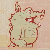
These pictures are the products of my experiment.
(That is the reason why 'my' Drimogemon self is in the same pose of the official reference art; I wanted to focus on style itself.)
The actual drawing is based on the Metro guidelines on icons; 'The best icons have simple geometry and limit the amount of fine detail.' The colours, however, are based on the Fluent Design palette, albeit expanded in that every colour (excluding pure black and pure white) gets the full range of 7 shades. What really brings out the look is, when I need to separate parts that have the same colour, my use of negative lines (that is, using the eraser) opposed to positive lines (actual outlines) or using different lighting or different textures on different parts.
Highlights are a stylistic choice that I always liked. Converting them to the experimental style was surprisingly easy. However, I am a little undecided on whether the highlight colours should be either the lightest shade or pure white. The lightest shade is easier on the sight, but pure white not only stays prominent even on light colours but also keeps the picture 'flat'. At this, point, though, I plan on sticking with the lightest shade.
Art is fun again.
══════════
White-Highlight Version
══════════
Drimogemon → Digimon → WiZ + Bandai → ???
══════════
These years, I have been thinking of an art style that was 'painless' yet 'pretty'. I found early on that the outline was the biggest bottleneck, plus I was a fan of the lineless art style. However, only recently did I consciously concentrate my efforts into finding a conclusive style.
When I took a look at Microsoft's Metro UI, everything 'clicked'.
I liked that flat look so much; I even formed my website theme around the interface one time. The simplicity of detail and colour was very appealing, but would that fit my needs in art?
These pictures are the products of my experiment.
(That is the reason why 'my' Drimogemon self is in the same pose of the official reference art; I wanted to focus on style itself.)
The actual drawing is based on the Metro guidelines on icons; 'The best icons have simple geometry and limit the amount of fine detail.' The colours, however, are based on the Fluent Design palette, albeit expanded in that every colour (excluding pure black and pure white) gets the full range of 7 shades. What really brings out the look is, when I need to separate parts that have the same colour, my use of negative lines (that is, using the eraser) opposed to positive lines (actual outlines) or using different lighting or different textures on different parts.
Highlights are a stylistic choice that I always liked. Converting them to the experimental style was surprisingly easy. However, I am a little undecided on whether the highlight colours should be either the lightest shade or pure white. The lightest shade is easier on the sight, but pure white not only stays prominent even on light colours but also keeps the picture 'flat'. At this, point, though, I plan on sticking with the lightest shade.
Art is fun again.
══════════
White-Highlight Version
══════════
Drimogemon → Digimon → WiZ + Bandai → ???
Category Artwork (Digital) / Fat Furs
Species Mammal (Other)
Size 1280 x 586px
File Size 16.8 kB

 FA+
FA+


Comments