 FA+
FA+
5027
Views
Views
219
Favorites
Favorites
Category
Artwork (Traditional) / Muscle
Species Leopard
Size 1065 x 1280
File Size 2.41 MB
Report this content
More from Jugg4


")


Listed in Folders


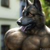
Big beefy snow leopard's asking if his average sized friend needs help, it seems last night they got a thick layer of snow and they should go to market together :3
He enjoys to show his big muscles and maybe they'll have some fun when they get back home, who knows what they are going to buy ;3
Paper quality allowed me to do pretty smooth graphite shading, I was using 0.5mm and 0.7mm propelling pencils (HB)
It's not always an easy task to choose which paper is good for your pic and style, fortunately this ended up to be a good choice for sharp details ^^
Paper size: A4
You're NOT allowed to sell or print my art for commercial purposes, nor use them in NFTs or in machine learning.

https://www.furaffinity.net/journal/10345863


ME AND MY BF HAVE COMBINED PATREON

https://www.patreon.com/JuggnMapp


FIND ME ALSO ON MY TELEGRAM CHANNEL

https://t.me/Jugg4rnautArt


ALSO ON BLUESKY

https://bsky.app/profile/jugg4.bsky.social


Find me also on:


https://itaku.ee/profile/jugg4


MASTODON

https://meow.social/@Jugg4


© 2025 Jugg4. All rights reserved. 


Category Artwork (Traditional) / Muscle
Species Leopard
Size 1065 x 1280px
File Size 2.41 MB
Listed in Folders


I swear you're making my job harder on purpose or something! (JK, of course)
The face on this one, I think, is one of your best yet. While he isn't making one clear expression (Happy, sad, angry, struggling, etc) his face manages to look expressive. I think that's mostly due to the eyes and eyebrows, and especially how the eyebrows seem to pop out a bit. I like how the ears are in slightly different directions too. It's just a nice little, natural detail.
Moving down, I like how did the traps. While they are massive, and boarderline hyper (to me at least), they don't take over his head or anything. The shoulder is also, unsurprisingly, amazing. I like the clear like of separation between the chest and front delt. Also worth mentioning is that oh so subtle line that tells someone where the front delt ends and the middle delt begins. His shoulders are also a nice size for the rest of him. Getting to his chest, again, more of the same. (In a good way of course) I love the separation between the pecs (It's also nice to see them pushing against each other when relaxed, but that obviously wasn't the point of the pose) The straining fibers are also great, along with the veins. While the veins don't pop out too much, it makes sense because he hasn't started working yet.
The biceps and triceps are amazing, as usual. While they do reach watermelon size, they aren't out of place here. They fit really well here. (And geeze, if they're thank big flexed like that, can't imagine what they're like doing a bicep pose!) That change in coat coloring on the bicep also looks really neat and certainly let's it show fully. As for the abs, well, I'm glad I finally got to this part because I wanted to tell you that I think they're some of your best, if not the best abs you've drawn. The reason for that is balance. They don't look as trim and recessed as some of your previous works (Though the recessed abs might have been due to the pose, I wouldn't know though) They also do a great job of filling the space given to the viewer. The aren't "hiding" but they don't dominate anything else either. The slight hint of an outward curve does a nice job of showing the viewer that this character has some really strong abs. It's a nice little touch and seems to be how some bodybuilders look nowadays, due to all the extra muscle they pack on (As opposed to the "Roid gut" as I think it's called) As a final little note, I think it's great how you make the abs not 100% symmetrical. It makes him look a bit more natural in my eyes. Oh yeah, almost forgot the forearms! It took me a while, but I finally saw how the hands were twisted in different ways, I like how you used that opportunity to show off as much of the forearms as you could. (And those things look bigger than a lot of guy's arms too! It's really fitting though!)
Finally, getting down to the lower body, I have one thing to say: Damn. I honestly wasn't expecting legs like he has, but man those are freaking massive. (Almost rivals the horse you drew a few months ago) I love how much effort you put into showing all the different groups of muscle on his quads. It really meshes perfectly with the upper body. How on Earth he got those Speedos on is another question in itself though!
And because I've written this much I figured why not add another section about bits I don't mention often. Honestly when I saw the tail at first, I thought it was a bit too thick, but after reading that he's a Snow Leopard, it certainly makes sense. Looks like he might work it out too! The bulge in his Speedos seems pretty typical for you, in terms of size. Certainly looks a bit like it's fighting for room with his quads, but I don't think that's a bad element of the drawing at all.
I think the one thing I'm a little "Ho-hum" about is the pose. I say that for one, because I don't think I could have said anything else, and I think another pose might have shown off his upper body better. I guess I just find it a touch of an odd pose, but maybe that's because it's not one we normally ever see. I think a Most Muscular pose could have shown the chest better, but the abs wouldn't be very visible. So basically, what I'm saying is "I really can't find much of anything, if anything at all, that I would improve in this."
Hope you find this helpful, and sorry it's getting to you a little later than usual.
Again, thank you so much for this qritique ^^ <3
Maybe it was a bit too long but it's okay :)
I agree with many points here. I finished this pic actually months ago, but is has been waiting for uploading among all other artworks.
That's why some details may look a bit, well.. spherical in my own eye. If I start the same project today, I'd do things differently ^^"
His left hand bothers me; it doesn't look good, but hands are difficult to draw, even for me, especially with graphite as there's a continuous danger to break the surface of paper by erasing it too much. That point about abs was good one, now that I think how better they'd look which a stronger outlines and shading, it would be cool to see. If I color this one in the future, I'd definitely test that :)
I'm really glad that you liked the lower body, I'm thinking to draw a backside pic about him in the future, revealing his massive thighs and butt ^^
Haha, yeah, I didn't realize how much I had written because mobile gives you only a few visible lines (5 I think)
Maybe because I don't really draw myself, but there isn't one place that jumps out at me as really spherical or something (Maybe the arms, but I'm not sure) On a positive note, it's actually a good thing to see you'd do it differently. Progress is progress after all.
Hands are the artist's immortal enemy it seems! I guess I never thought about the paper, but I have certainly had that happen to me, where it rips after erasing too much. That's an interesting thought about the abs, and I'm sure it'll look great if you decide to give it a shot.
That would be fun! I'm sure his back is about as wide as a service road too.


Comments