 FA+
FA+
916
Views
Views
35
Favorites
Favorites
Category
Artwork (Digital) / Macro / Micro
Species Dragon (Other)
Size 900 x 1030
File Size 290.7 kB
Report this content
More from Slate_D


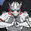
First off, yes, this is my character Trinity. For a while, she was my pirate character, in the 1600's. But now she is in the future. I'm actually writing a story to explain it, so I won't do so here, mostly because of the Weak-fi. Even now, I'm typing this description on a separate document that I plan on copy pasting.
Now, Trinity has never had wings, so things that fly, from the smallest insect, to the mighty eagle, have fascinated her. Since coming to the future, she has also taken a liking to growth devices. Combine this with her high status in Slate's faction, and you get a Captain who will often go to the nearest planet, shirk her responsibilities, and, much to there dismay, play with her crew in a cat and mouse type game.
Art & character © Slate_D
Stay tuned for the story!
Now, Trinity has never had wings, so things that fly, from the smallest insect, to the mighty eagle, have fascinated her. Since coming to the future, she has also taken a liking to growth devices. Combine this with her high status in Slate's faction, and you get a Captain who will often go to the nearest planet, shirk her responsibilities, and, much to there dismay, play with her crew in a cat and mouse type game.
Art & character ©
 Slate_D
Stay tuned for the story!
Category Artwork (Digital) / Macro / Micro
Species Dragon (Other)
Size 900 x 1030px
File Size 290.7 kB


Might I offer a critique? Pass this over if y'don't.
From my point of view, her eyes are a little too high on her head, making her muzzle a little equally too large. It makes her head seem a little larger than it should be.
My last minor note is her leg and foot. The perspective sort of distorts that a little, so you should change the angle at which her foot comes up from the ground so it looks more natural.
That said! Very good job with the hand, not too many people, myself included, could pull that view off as well as you did.
That's all I gotta say, at least.


SLATE!!!!!
YOU'RE***
I DIDN'T EXPECT IT FROM YOU!!!
That said, I like where your new kind of style is going. Things seem more natural, and not forced. AAAAND That said, the palm of the right hand in the first panel looks too small, but I couldn't help but admire that same hand in the second one. :D
YOU'RE***
I DIDN'T EXPECT IT FROM YOU!!!
That said, I like where your new kind of style is going. Things seem more natural, and not forced. AAAAND That said, the palm of the right hand in the first panel looks too small, but I couldn't help but admire that same hand in the second one. :D


Comments