 FA+
FA+
238
Views
Views
7
Favorites
Favorites
Category
Artwork (Digital) / Fantasy
Species Unspecified / Any
Size 871 x 873
File Size 130.3 kB
Report this content
More from DreamersDestiny


Looking for critique. Hopefully to peak interest in what I can fix and actually start working on it again. x_x
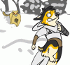
She's my Druid character, who has literally forgotten her name because she's been travelling on her own and with animals much too long. She's basically wild. The Elk is her Mount, the Kestrel her Guardian Animal and the Oak leaf represents her God, Silvanus.
Its a rough sketch, so sue me. I'll scrap it later.
Druid © Me.
Category Artwork (Digital) / Fantasy
Species Unspecified / Any
Size 871 x 873px
File Size 130.3 kB


you asked for a critique, and i guess you should get at least one.....
well, it's an overall decent piece. the composition and quality is nice. there are a few flaws though
the character/main focus of the piece has a few problems with how it's facial features interact, mostly the eyes and eyebrows. either the eye's are slight too low, the brows are slightly too hign, or a bit of both. regardless, makes them look too detached from each other, leaving them with a vaguely stupid or drunk look. their ears are also too low, and are interfering with his jawline. oh, and the hairline receeds excessively. it's clearly done to keep it out of their face, but it's enough that their head looks long.
the bird is fine, although it might look better with less spots and a more pronounced chest. it seems a bit too slim considering the way bird's wing muscles attach to the ribcage, with the big flange sticking out the front. still, not enough to bother with unless someone was paying some good money for it.
the elk is pretty much fine by itself, but it detracts from the characters slightly because it's antlers are kind of breaking up the focus. you may wish to consider tilting the head more forward so the antlers provide a better "frame", although i wouldn't have it simply looking straight ahead in this case.
hope that helps. i'll go back where i came from.
finally, the oak leaf should probably flare out more at the base (or am i thinking of maple leaves? they're so simeler) and i'd suggest light;y hinting at the lines of a face in the design.
There's some compositional things with her head framed by the antlers, and the way the kestrel doesn't quite overlap the elk's back, which I think could flow better. It's not hugely off, just I think it could "flow" better with directing the viewer's eye around things.
That said I think it's a seriously cool picture.
That said I think it's a seriously cool picture.
Comments