 FA+
FA+
287
Views
Views
9
Favorites
Favorites
Category
Artwork (Digital) / Fantasy
Species Wyvern
Size 1261 x 882
File Size 996.8 kB
Report this content
More from Banana-Skink


Ginger will touch a prickly pear, she doesn't give a shit, watch her dude.
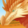
I'm still experimenting with this style of painting, somehow this one look even longer than the last one, around 15+ hours, but I'm really happy I stuck with it, and didn't throw in the towel when it got to the details like the feathers and prickly pear.
Still got no idea what I'm doing with backgrounds tho rip.
I love the aesthetic of the Aussie outback. I would absolutely die out there though for real.
I had fun though! and I'll keep trying with this painting style, and working on less layers with less outlines! (three layers for this one)
character and art © Panoptos / Banana-Skink
panoptos.deviantart / panoptos.tumblr / panoptosart@ twitter / panoptos@ toyhou.se / banana-skink@ weasyl / banana-skink@ FA
DO NOT USE, EDIT, COPY, TRACE, AND/OR REDISTRIBUTE.
Category Artwork (Digital) / Fantasy
Species Wyvern
Size 1261 x 882px
File Size 996.8 kB

Pfsh
Well in terms of lighting, the pastels are really pleasing, though the character could use some more contrast? Since in direct sunlight shadows are pretty strong and even if the light bounces from the ground onto the character from the bottom, there'd be a bunch of places and creases where that wouldn't get so much light. And then I can add, that usually the shade would look the darkest by the edge of it. (where it meets light). And on top of that it'd also should look strongest where it's closest to 'camera' and focal point. But thas me gettin off topic.
The other thing I wanted to mention is just the composition, chara might be a bit too close to the edges, so it feels a bit sliding out of the picture, could use some more room c:
But still, it's a ver nice paintin, fren, pleasin to me eyes :>
OOOOOOOO thank you friend!! Those are some really good points, and you've worded them in a way that I can understand really easy, so thank you pal! I really appreciate that you would actually like give constructive criticism? HELPS ME IMPROVE DUDE
I will definitely remember to think of this for future works!
I will definitely remember to think of this for future works!
Comments