
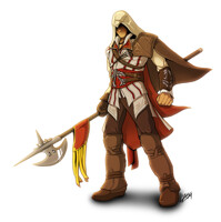
... what I've been working on the last two weeks, a few hours here and there... per se.. more Assassin's Creed stuff...
It's an alternative Cover for the PS3 Classics Edition as I didn't like that one it comes with (that classics border is just ugly..)
so I decided, why not paint my own ;p
Still quite a not so common work from me, isn't it? Due to the fact that my fulltime-job is approx. 100% digital painting stuff I submit a lot of comic artworks as I don't want to do all the same in my freetime too ;)
Asking for critique, but not sure if I will be able to do any changes, as the file is really huge already...
Background: clouds, dust and dirt was created using texture brushes I made myself, flags are just flat objects with two colors I bent the way the are shown using the Warp-tool in Photoshop.
Character: painted all new, reference for the character details used, so that I know where he has all that stuff placed on his body XD didn't use any references anatomy-wise though, so it might be off on a few edges. Horse is also painted completely new in Photoshop, mane was created using a special hair brush.
sop... that's it, hope you like the outcome, I am going to make a cover for the PS3 gamebox now so that I can use it for real ;p
Assassin's Creed © Ubisoft
FULLVIEW is a good idea! :D
PS.: also shows my Japanese Painter stamp
Category Artwork (Digital) / Fanart
Species Horse
Size 1000 x 1200px
File Size 634.1 kB
First, I just gotta say...Wow.
The degree of awesome you already have here is phenomenal. I will try to be helpful since I think you have TERRIFIED the other folks here who sometimes offer critique. I can't discuss costume design or equipment because I don't know the game except by reputation and am not familiar with how it looks. I understand you probably already have a billion layers and require a Cray to do any further touch-ups, but since you asked...
The two small knives at the character's waist look as if the handles are porcelain. They almost glow and have a full silhouetted highlight around their edges as if they were backlit, but the shadows of the knives against the fabric clearly show them to be lit from the front. If they are supposed to be shiny-shiny porcelain with a somewhat transparent-glazed surface that acts as a light-guide at the edges, then it works. If they are supposed to be steel, that isn't how my eye reads them.
If the light is coming from the figures' front (viewer right shoulder) as it seems to be in most of the image, then the base of the horse's jaw where it meets the neck, right where it runs parallel to the throat-lash of the bridle could use a little more and deeper shadow.
It may be specific to the reference material/game art, but the bridle hasn't got a browband.
The forelock of the horse's mane isn't quite as awesome as the mane along the neck.
The highlight of the horse's eye seems to infer that the light is coming from around 11 o'clock, but this doesn't match the shading on the nape of the horse's neck. I would expect that highlight to be at about 1 o'clock.
The cinch of the saddle where it passes around the horse's belly shows folds in the 'cloth' (s/b leather but hey) but the highlighting of those folds doesn't reflect the (mostly) frontal lighting of the figure and horse.
In fact the lighting of the horse has a lot of things going on with it which make me think it was assembled from either a few different horse photographs for reference or one which had really unusual lighting. I say this because the background foreleg has shadow facing the viewer and silhouetted lighting on the upper and front surface, the foreground foreleg appears to be lit from the viewer's right shoulder and forward of the horse...And the chest in between is in shadow. It's not horrible. It's not a barbed eye-hook. It's just something one notices when trying to pick apart details.
What IS a real barbed eye-hook to me is that stone wall. Everything else here looks like a great deal of time was spent on it and like it was primarily worked up by hand. The stone wall seriously looks like a photo that has been slightly tweaked and warped and gone over a bit with a few brushes. It's much more plastic and photograph copypasta looking, where nothing else in the image is.
On a 'personal choice' note, I wouldn't have cut off the tips of the horse's hooves or the rider's boot. It creates a strange 'there is ground right down here just out of line of sight' illusion, and when I first glanced at the image before really seeing it, I thought that the man was walking _beside_ a well-kitted pony, with his left-leg mostly hidden by the swirl of his robes. If I were cropping a photograph of this, I'd want to be sure there was visible open air beneath the horse's hooves and the rider's boot. In a similar flow-of-line issue, I'd have the tips of some of the (spears?) visible in the background behind the horse's forelegs visible either above or below it, so they don't all end hidden behind the horse.
There is something peculiar, perspective-wise, between the angle of the blade, the apparent angle of the hilt, and the pommel. If the hilt is not bilaterally symmetric, then everything is cool. It's difficult for me to tell if I'm looking at a sword with a hilt that is longer on one side of the blade than the other, or if the pommel is twisted around in relation to the blade.
Now having said all of that...It is still made of awesome and looks very, very good. The flow of action is beautiful, there's just enough dirt and grit and haze to add to the air of realism without making it look like you have a thing for smog. The texture of the horse's hide works wonderfully. I am particularly enamored of the work you did on the horse's muzzle and nose where the white darkens to grey, although I would expect to see teeth given the angle and openness of the mouth. Pardon me while I go barricade my door against the torch-and-pitchfork weilding masses.
Oh wow, now that's quite a bunch Thanks a lot anyway
Concerning the light source, in general I would dare to say I put it up quite "neutral" the biggest parts are shaded using a direct light from front and right side, didn't really went too correct there *blush* also because I painted the parts in a extreme zoom, so you tend to get the over-all light feeling lost. On the other hand, with that light-theme around, the dark clouds etc. it would've been extreme dark if I would've assembled the realistic way there, anyway, guess I just used too less reference for the light/shading of the horse and some other parts ;)
Concerning the bridle, as I only know the german word for it, I am not sure if it's the thing placed under the mane (forehead) you mean with browband, if it's that, it's actually there just extremely hard to see ;p
and that wall really bothers me too, it's actually a 3D texture made into a brush and pattern, put together and tilted.. though I blurred it in the end because it looked too sharp for my taste, no idea what I could put up there instead though.
nyyyyyaa, don't think anybody will go crazy (and all that flame-y XD ) about your critique points , I agree on all of them, as I mentioned, not sure if I can make changes on this piece but it's still an AWESOME Help for future pieces! so thanks a lot again!
It's an alternative Cover for the PS3 Classics Edition as I didn't like that one it comes with (that classics border is just ugly..) so I decided, why not paint my own ;p
... *growls* I absolutely despise you for being able to say that. And I mean that in a very appreciative, awe-inspiring way.
... *growls* I absolutely despise you for being able to say that. And I mean that in a very appreciative, awe-inspiring way.

 FA+
FA+



















Comments