 FA+
FA+
2063
Views
Views
79
Favorites
Favorites
Category
All / All
Species Rabbit / Hare
Size 689 x 1017
File Size 680.2 kB
Report this content
★
More from o-kemono


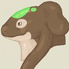
Gamestop Bunny Concept
This is something I am sending to GameStop HQ. Everyone at my work place loves the idea and are pushing me to send it. Some think that the red/black eyes are kindof creepy, but white, red and black are GameStop's buisness colors.
Art Concept © 2009 Alex Cockburn
Art Concept © 2009 Alex Cockburn
Category All / All
Species Rabbit / Hare
Size 689 x 1017px
File Size 680.2 kB

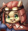


What I mean is that the design can be stronger. From experience the silhouette of a character no only should be instantly recognizable of what and who he or she is, but also tell a story about the character's personality and intentions. What I see with this bunny's silhouette is that reads cute and hug able but the face says something different. If the artist intentions are that bunny is cute then the face read the same On the other hand if the artist wants a more sinister side the silhouette should have less soft curves and more angular outlines. Now if the artist intends both he should try to experiment both the face and the silhouette until he gets the design possible. Do keep in mind that I am critiquing not criticizing. My experience of character design happens to come from going to an art and film making college that I'm still attending.
So, you think that perhaps the bunny from her store badge,
http://www.furaffinity.net/view/2129514
Here, would fit better? Mostly considering the bottom bunny, but that would be more 'edgy', while getting rid of the soft and huggable aspect drastically. The headband would give a unique characteristic, while bringing the character to the demographic of a majority of gamers (Age 15 to 25 (About)). That specific pose may need to be changed a little, but a little fine tuning, incorporating the things you said, would solve that easily.
It is better but still the silhouette is still a bit too soft. She Should try tightening and sharpening some of those curves. Being that its for Game Stop I think cell shading with a limited color palate might best. Try looking in my gallery for some examples. You will see what I mean.


Very cute ^^ especially the range of poses you've got ^^
The chibi poses work well (especially all the different products) and the mismatched eyes seem fine to me ^^ in the larger picture it's a bit more obvious but the background brings it in a little more ^^
I hope HQ likes it - especially with all the hard work you've been putting in with at work ^^
The chibi poses work well (especially all the different products) and the mismatched eyes seem fine to me ^^ in the larger picture it's a bit more obvious but the background brings it in a little more ^^
I hope HQ likes it - especially with all the hard work you've been putting in with at work ^^

I dunno, I like it. The mix-matched colored eyes with the colors of the business is kind of a neat idea, IMO, but I wonder how many people would catch the subtlety.
Can't hurt, though, worst that can ya be told is "no", but see if corporate will let your store use it anyways...giving your store a unique flare =D
Can't hurt, though, worst that can ya be told is "no", but see if corporate will let your store use it anyways...giving your store a unique flare =D


I like the eyes; I don't find them creepy. It's a simple, cool design, easy to remember (for any kid who saw the store but didn't catch the name) and to recognize. (Only: the "lights" in the eyes on the big picture end up in the position of pupils, which confuses my eyes, but I'm not sure that's a problem to anyone else. Maybe they should be a little further to one side to look more like reflections.)
I can't get over how adorable your bunnies are, just like the rest of your animals. You draw fur so that I can feel the density of it! (coupled with a wish to swipe the bunny for cuddles) A videogame store that had those on cardboard all over their shelves would draw me in for sure. I like it when stores / chains have their own special mascot.
I can't get over how adorable your bunnies are, just like the rest of your animals. You draw fur so that I can feel the density of it! (coupled with a wish to swipe the bunny for cuddles) A videogame store that had those on cardboard all over their shelves would draw me in for sure. I like it when stores / chains have their own special mascot.


Gamestop's rabbit is suppose to be a smartass gamer, so I think the design needs to show that more.
Red/Black eyes is kinda cool but I can see where people think it creepy. Maybe give him just the red eyes (I liked the other drawing you did) and then make the inner ears black and pads black. It's different, but cool.
I really hate the rabbit they have right now. The art is terrible. A pre-schooler could draw better than that. Just grah. So I really really really hope yours might make somewhat of a difference.


Bunny 1: Yes, the Xbox 360 games are on that shelf, sorted alphabetically...
Bunny 2: Of course, let me get that controller down for you...
Bunny 3: Hmm... let me see if we have that title available...
Bunny 4: Here's out GameStop Rewards Card; it offers you a lot of cool stuff, you know?
Bunny 5: You can have this used controller and game for less than you would if you bought them new...
Bunny 6: Yes sir; we have that title in-stock; I'll hold it for you while you come to our store...
Big bunny: GAMESTOP - POWER TO THE BUNNIES... Er, i meant... To the players.... yeah! That's what I meant :3


Was watching an older FrameRater video on the concept of the old Gamestop mascot, and as soon as I saw him mention that you had done a concept for it and I had to see it for myself
Honestly, the art is absolutely adorable and probably would have made a great mascot if they wanted to go this direction, though I suppose the one they went with fit the brand a bit more, at least, while they were still around x-x
Honestly, the art is absolutely adorable and probably would have made a great mascot if they wanted to go this direction, though I suppose the one they went with fit the brand a bit more, at least, while they were still around x-x
Comments