 FA+
FA+
2805
Views
Views
108
Favorites
Favorites
Category
Artwork (Digital) / Fantasy
Species Dragon (Other)
Size 905 x 1280
File Size 156.6 kB
Report this content
More from Scritt


Listed in Folders

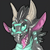
Seriously he seems so proud of that tongue. I wonder what he uses it for :}
Character and art is © Scritt 2016
Result of an art exercise combining a couple of techniques I've learned recently.
Still room for improvement but I like the result.
Mrawr <3
Character and art is ©
Scritt 2016Result of an art exercise combining a couple of techniques I've learned recently.
Still room for improvement but I like the result.
Mrawr <3
Category Artwork (Digital) / Fantasy
Species Dragon (Other)
Size 905 x 1280px
File Size 156.6 kB
Listed in Folders


You could be my twin brother! Your character is very similar with mine!
https://www.furaffinity.net/view/20995400/
https://www.furaffinity.net/view/20995400/


This one is done in Krita.
That in itself means it has a different workflow.
It's more of a painting than a drawing - and that means that many details are simply painted onto the same layer.
The detailed scales are made by drawing a large solid area and erasing out some scales with a small eraser. Going all the way around each scale ensures rounded corners.
I've then set that layer to 'preserve alpha' meaning you can't erase or add content - only change the color.
That allows making the reflections of the sky and sun by just drawing over all of it. I then finish by drawing in individual scales with a separate brush - along the edges of the character.
In the painting style of drawing, it's often quite messy until very late in the process - I then simply erase everything around the character itself, leaving it nice and clean, and without any lineart - but there was never any lineart in this case.
Notice that I use two different colors for shading - I use blue and orange.
I use orange for weak highlights facing the light source (sun) and bright orange for direct reflections.
Not everything has to be reflective, and if you have some scales on top of a matte surface, only the scales need reflection highlights.
An orange light source usually casts a shadow of the opposite color - blue. Hence why on the other side, the entire character is slightly blue instead.
For the neck plates I also utilize the technique of drawing a larger area and erasing in between instead of drawing each scale.
This is a great thing to experiment with in all aspects of art.
Do you draw something (a positive) Or do you erase what's not that something (thinking in negative).
Almost any task can be done either way, and sometimes one is significantly easier.
Drawing 10 scales takes a lot of precision. Drawing a line and erasing 10 shapes in it is really easy.
Likewise, if something falls outside your character, just erase it for a super clean edge, instead of defining the edge first with lineart, forcing yourself to fill that out for the rest of the process.
But that's just this one painting approach, which is more effective in Krita.
If you use other software, Lineart first is often easier - or a sketch first, and then drawing in the lineart once you've done everything else.
Even in PS the negative scale texture technique works really well.
You can lock the transparency and shade that layer separately afterwards, to give hints of reflection - or just a different level of reflectiveness from the base shading.
If I worked in traditional art software such as photoshop:
1) I'd do a sketch like this. set blend mode to multiply and put it up top.
2) I'd fill it out with grey and make that a transparency mask for later layers.
3) I'd add shadows Large round soft shadow brushes, and erase areas that face the light source to create highlights. Need to show bulging and ripples? Flesh them out with shadows. Also, adjust shadow opacity to determine the overall light level in the drawing.
4) I'd add a light layer - doing the same thing but erasing to create shadows - character has wrinkles? Erase them out of the light layer - set the opacity afterwards to determine how reflective the characters base skin is.
(note the blend mode and colors for shadows and light can be fun to play around with. I often do blueish dark grey shadows and right yellow or orange light)
5) Hide light and shadow layers and draw in the color layer (and put it under them). These are your base colors - no light or shadow. Just the actual color of the character.
You can give it a lot of personality by adding imperfections and splotches of colors here and there, or just some spots outside where that color would normally be.
That's the beginning of most of my drawing processes.
Sometimes if I feel like doing highly realistic lighting I'll repeat the light and shadow layer process for every light source.
The light is colored like the source and the shadows have the opposite color (in a very dark version).
This can take a LONG time but yields results like this: http://www.furaffinity.net/view/19395064/


Comments