 FA+
FA+
6304
Views
Views
390
Favorites
Favorites
Category
Artwork (Digital) / All
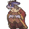
Species Shark
Size 798 x 1280
File Size 1.56 MB
Report this content
More from Darbaras


Listed in Folders


Right brain: Oh man, I have such a cool idea of Tia and Sajiid in the radio room sitting at a desk wth bulky headsets, trying to make contact with the surface, lots of communication equipment around, papers of all kind, an empy metal mug and a full ashtray on the table ... Sajiid is sitting and ...
Left brain: ... nah, just draw Tia stading still, preferably from behind, I wanna see some ass.
Right brain: Sure! Can I draw a background to it?
Left brain: Whatever, knock yourself out.
*Two weeks later*
Another fantastic new piece of Tia standing. Outstanding job, Darb!
I gotta be honest, I'm super disappointed with this one; boring idea, the colours don't harmonise, Tia gets lost in the shit around her as I wanted to force all this crap into a frame, ruining the composition. Good job. *claps*
Whatever.
I think I'm gonna retire her for a little while, till I get more creative, because I really got bored of these.
- PaintTool SAI 1.1.0 -
Category Artwork (Digital) / All
Species Shark
Size 798 x 1280px
File Size 1.56 MB

Yeah ... Everything has the same colour, same lighting, so she gets lost. The character and the background kinda like fighting for the viewer's focus, killing the whole aesthetic. The level of detail wasn't that problematic while I was working with the colour mockup, but I somehow screwed up the whole balance with the final lighting.
Thank you. I hope I can show more of this world later on.
Thank you. I hope I can show more of this world later on.

"I wanna see some ass" Does your left brain have any relation to my brain?
Jokes aside; I'd argue you're too hard on yourself but BAH, I can't draw in your kind of quality, so I wont start. But if it comforts at all, I do think this artpiece is good <:
Tho I must admit, I really love how you do lighting/shading! And like previous art pieces, it shows here as well! Also I hope you find your mojo for creativity and the alike, its never fun to be dried out in ideas and motivation for doodlin' characters! :c
I never really knew how her tail would join to her body, so this was done for as conceptual picture. Of course, I could have just draw her a turnaround or a few simple pictures with no lighting, but I had the urge to pointlessly overcomplicate everything.
Thank you. I have a few works I'm actually satisfied with like 'Am Fenster', 'At ease' or 'Carano e Vasco', but this one wasn't well-put together. I think I'm gonna draw some other characters, for a little while until I get an idea for her worthy of investing time.
Thank you. I have a few works I'm actually satisfied with like 'Am Fenster', 'At ease' or 'Carano e Vasco', but this one wasn't well-put together. I think I'm gonna draw some other characters, for a little while until I get an idea for her worthy of investing time.

No strain on my end. Just looks like awesome art to me.
Remember, too, that pretty much everyone else that looks at your picture isn't going to be comparing it to the mental expectation you built as you worked on it. We just see something that looks really good out of nowhere. Great details, great background work, great lining and inking, cool pose, etc. That "creator-vision" can be an artist's worst enemy sometimes! ...so yeah, getting a pic you're happy with can be really tough sometimes, but to everyone else without that expectation, you're doing pretty freaking fantastic from here! Hold onto that positive part!
Remember, too, that pretty much everyone else that looks at your picture isn't going to be comparing it to the mental expectation you built as you worked on it. We just see something that looks really good out of nowhere. Great details, great background work, great lining and inking, cool pose, etc. That "creator-vision" can be an artist's worst enemy sometimes! ...so yeah, getting a pic you're happy with can be really tough sometimes, but to everyone else without that expectation, you're doing pretty freaking fantastic from here! Hold onto that positive part!

Don't you remember what we just talked about recently about making pictures look more cinematic and life-like as opposed to being perfectly staged and composed? This looks incredible. I don't care what anyone (yourself included) says otherwise. Tia wanders into a setting like this, the inanimate objects aren't going to rearrange themselves to lend a perfect scene for her. It does not look cluttered. The colors are fucking gorgeous. It looks like a slice of life scene - a moment in her day. You've stared at it too long is all. Stop being so hard on yourself <3
I do, but my main problem isn't with the overall composition, it's the way I shaded and lit the whole scene. Life-like scene or nor, I don't know where to look; everything here demands attention. The sub one was just as cluttered, even more than this one, yet it's pleasing to look at; the colours are well separated and the lighting is subtle enough.
It looked so well on the colour draft, even with the final lines, but I screwed up big time when I applied the highlights. It really breaks my heart to see how much better it would have been I just pay attention. It's not the concept that doesn't work, but the rushed and sloppy execution.
I'm glad you like it .. at least it has more value to it than a painful lesson.

The amount of details are fine ... Hell, look at Guarnido's art; several times the details, yet they're pleasing to look at, they lead your eyes. It's just I did the lighting so poorly.
It's good to hear you like it. I hope you'll learn from my mistakes here.
It's good to hear you like it. I hope you'll learn from my mistakes here.

All those details :O. I feel like this could be the cover of a book, it speaks so much about the setting and the ambiance. I agree with Nim, nothing looks cluttered or washed, in fact I think it all matches together very well. The colors of beautiful and contrast well with each other :).
Everything was fine till I added the lights. It was fun doing the research on cranes, shipping crates, warehouses or old Italian trucks. The whole image feel like a burnt cake; could have been the most tasty treat one you could have had in a while, but it was left in the oven for just ten minutes more; the sweetness is gone, just a bitter brunt aftertaste remains.

No! Don't retire her, she looks great! Plus, her surface diving gear give a sense of things shark people would salvage and put together to survive on land (I'm sure no two sets are alike). I'm still looking forward to seeing her underwater (probably with Elise in scuba), to see how she treats "invaders".
It won't be forever, just a month or two maybe, until I find an good idea that will work well, in the meantime, I'll try to pull myself together and learn a bit more about colours and lighting. Yeah, that's pretty much the concept here, most gears are modified rebreathers using car or motorcycle parts. The navy provides sharks mass-produced gear, but they are generally disliked for having weak performances.
Ah sorry man, even if I ever draw Tia underwater, she's definitely not going to hurt Elise doing so.
Ah sorry man, even if I ever draw Tia underwater, she's definitely not going to hurt Elise doing so.

I'm really glad you like visuals of the surroundings. You are pretty much spot on; the story takes place in an alternate universe where WW2 didn't happen on a large scale, and much of the technological advancements are absent, meaning it's pretty much the 50's world here, despite the story taking place in the early 70's.

Yeah, the everyday struggle between the two ...
I'm so glad you like it even with its many shortcomings. It would have been so much better if I pay at least a bit more attention to the lights. With ideas like this - draw Tia from behind to see how her tail connects - would have worked just as well - if not better - with a simple background. I man, the first couple of images were just like that; only Tia.
I'm so glad you like it even with its many shortcomings. It would have been so much better if I pay at least a bit more attention to the lights. With ideas like this - draw Tia from behind to see how her tail connects - would have worked just as well - if not better - with a simple background. I man, the first couple of images were just like that; only Tia.


*gives a big row for being too hard on yourself!*
seriously, this turned out beautiful man.. got a feeling you're just sick of the sight of it, but as i've said on de skypes; i adooooore the colours!
i really love how its all working together; i don't get a sense of clutter, or details battling or anything like that; feels like a proper scene; Tia is properly involved with her surrounding, and the lighting throughout is sublime.. so feels liek you could turn your head to where Tia's looking, and catch sight of a settgin sun, ehhe <3
i honestly really, really fucking love this piece, and the details are so amazing, as well as the mood, stance and proportions etc etc!
it's all lush <3
It's just I almost got it, almost got the look I wanted. It looked acceptable until I looked at an earlier colour draft. That one had such a better contrast and readability to it, much, much more subtle.
I had nothing wrong with whole concept, I wanted something of a simple scene, where not much happens, but we can still kinda guess what's happening. I'm glad you got that feeling, that somehow the atmosphere reached you, meaning it wasn't just a huge waste of time.
Thank you once again .. I really hope I can pull off something with her that's much better put together.

I love me some good entertainment for my eyes - all the details to discover and take in one by one! Darb, Fer is totes right: you are going too hard on yourself! The colours are beautiful and even if the pic is busy, it has such a great atmosphere and so many treats to the eyes that it's a joy merely to let one's attention wander around it, and butts. C:
Ah, I'm glad you like it, though I'm sure it would have been better if you didn't have to apply two litres of eye drops to ease the pain after finding them all in this mess. I love pictures with 'simply detailed' environments too, but the way I lit this pic i just confusing to the eyes. My only hope at the moment is the piece I'm currently working on will turn out better.

Ah, thank you for thinking so. True. we always have a very specific image in our heads, its just I take any form of difference from it as a failure, no matter what the result actually looks like. Normally I'd say I've learnt a few things here, and I did, but had such high hopes for this one ... Maybe I'll revise this one to make it closer to the colour mockup I loved so much.
I see what you mean re: colors, but damn, this is impressive work. You have a real knack for drawing industrial scenes and architecture. Even in a work you consider a failure, that knowledge shines through in your detail and composition--it's incredibly impressive.
And no shame in drawing the same character standing over and over--it's fun and low stress and people on art sites like this dig that stuff. ^^
And no shame in drawing the same character standing over and over--it's fun and low stress and people on art sites like this dig that stuff. ^^

Comments