 FA+
FA+


1515 submissions


Good now it is time for beach volleyball
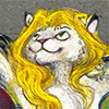
Retta © Maxi-Rover and I've been promising to draw her for months! She's Popeye the Sailor Man, toot toot.
Trying to synthezise what I learned from both her and PegiBruno, go watch them because they're both amazing. I'm still getting used to sketching the initial drawing straight into a computer, so wish me luck on that front.
Listened to while drawing: Janet Jackson's "Control," King Crimson's "Discipline," the original cast recording of "Sunday in the Park With George," Frost's "Experiments in Mass Appeal," Sleep's "Holy Mountain," Gary Clark's "Bright Lights" EP, and the soundtrack to "Rushmore." (shrugs)
Retta ©
 Maxi-Rover and I've been promising to draw her for months! She's Popeye the Sailor Man, toot toot.
Trying to synthezise what I learned from both her and
 PegiBruno, go watch them because they're both amazing. I'm still getting used to sketching the initial drawing straight into a computer, so wish me luck on that front.
Listened to while drawing: Janet Jackson's "Control," King Crimson's "Discipline," the original cast recording of "Sunday in the Park With George," Frost's "Experiments in Mass Appeal," Sleep's "Holy Mountain," Gary Clark's "Bright Lights" EP, and the soundtrack to "Rushmore." (shrugs)
Category Artwork (Digital) / Muscle
Species Unspecified / Any
Size 1241 x 1280px
File Size 218.7 kB
YOUUUUUUUUU!!
AHHH
THISSSS
IS SO EXCITING! So zany! I can really see a lot of looseness and whacky posing from pegi's style. PREETTY damn awesome, I must say! I like how you've snuck a lot of her colors into the background as well! Helps unify everything a lot. I always have issues with that XD UGH just gimme those popeye arms ANYDAY, just wanna eat em up! UGH I love thisssfkdsla;fjsaf you're amazing! <3
I have a bad habit of making paintings with no real orientation - top down views, scenes in space, that sort of thing, but far too many of my pieces would look equally plausible upside down or sideways. I just love for things to be flying, but it's a pain when you're putting it someplace else. I'd love to display artwork on a table instead of a wall, so you can walk around it and see the orientation...
And yep, it feels really good to make the linework one long drag with the pen, can't tell you why.
Eeegh, thanks! I'm always worried that my appetite for saturated apple yellow-greens gets distracting and doesn't really feel like dune grass, so the purple was just to neutralize it... but I'm really starting these days to question established color wisdom. What makes something complementary, and if the color wheel has so many variations, why do "triadic" and "split complementary" and all those other foolproof plug-in-and-paint color schemes, why the fuck do we just take those as dogma? Why would they make things more harmonious? It's like, I'd rather play Wagner or Debussy and get all these fucking diatonics out of my system than I'd like to play some hamfisted Victorian parlor song drenched in unembellished major chords for every strike.
As a disciple of Chomsky and massive Bernstein fan, if I can apply THIS, you can see what I'm thinking of against. If I can split the color wheel into the same intervals as a musical octave, fucked up versions of the half step so it can be transposed into any key without fucking things up (you'll notice that when you use the hue slider in photoshop over the whole image, it looks much less varied in its color...), then I'd be able to compose without having to guess so goddamn often. Thank god for neutrals.
And you should have seen her first draft, before I figured out how to neutralize her ochre body, she looked like she was made out of translucent snot. Not sure if that's kinky for you.
Go eat her up, she's delicious. She's popeye the sailor man, she lives in the garbage can...

Comments