 FA+
FA+
1059
Views
Views
31
Favorites
Favorites
Category
Artwork (Digital) / Tutorials
Species Wolf
Size 482 x 1280
File Size 153.1 kB
Report this content
More from Leucrotta


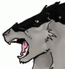
Figure people might like process discussions. Finished picture at; http://www.furaffinity.net/view/18602193/
1. Black and white drawing in traditional media. This is one of the bigger shortcomings I have right now - since I'm not working fully digitally, it's harder for me to tweak linework. Because multiply layers aren’t completely opaque I use Photoshop to convert this to a colored ink layer using masks (process courtesy of Claire Hummel’s DA).
2. Flatting. I try to block in color on different layers - I'm using the lasso tool, and touching up with brush and eraser to fill in the biggest areas of color. What I'm trying to do is lay in kinda the basic color scheme, and also create areas I can use as masks later. YMMV.
3. Blocking in a little more color detail and tone. I'm trying to lay this down really really quickly and kinda create the overall picture without getting caught up in rendering. Here, I'm using the big flat areas from earlier for masks, and painting using the opacity set to my stylus so that the basic color scheme I thought about will show through. (Trent Kaniuga is a big influence here.) You'll notice that I tweaked that layer with the full moon; I'd always intended to put that in digitally and after flatting things out felt the picture looked a little better with the moon silhouetting the werewolf's hand and head. I'm still not sure if that was a good decision.
4. Refining the color information that I put in earlier, using soft edged brushes and the opacity set to the stylus to help blend for the most part. I'll use hard-edged brushes too, 'cause some things look better to me with a hard edge on them. Something I'm still not great at is adding enough value contrast, so here's a good place for me to try and push that a little bit further. I also try to add more bounce light. This is also the point where I noticed that the stuff in the laboratory should probably get some shadows to indicate the light source further inside the room.
You'll also notice that this is before I painted the broken glass because I was trying to think of how to do it and figured this was a good spot to pause (eventually what I did was "flat out" the glass on a multiply layer; I turned the opacity down, and then I put another layer on top of *that* where I painted in blue, or orange-yellow, light, hoping that would look a little more believably reflective).
Hope this is useful!
Category Artwork (Digital) / Tutorials
Species Wolf
Size 482 x 1280px
File Size 153.1 kB

Impressive work as always. I like your version of Frankenstein, he looks more...well real. His dimensions would be of a surgeon trying to stuff body parts together so it all wouldn't mesh together. Though, I'm surprised. I'd have figured these two would have gotten along. Both are hated for what they are


Comments