 FA+
FA+
2296
Views
Views
135
Favorites
Favorites
Category
All / All
Species Unspecified / Any
Size 1280 x 1122
File Size 306.4 kB
Report this content
★
More from kaitycuddle


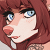
"slumber party" process
normally I would have made a pretty gif but I no longer have ps so THIS WILL DO
1. rough concept sketch. a super shitty sketch that is only used to figure out the pose.
2. SECOND rough sketch. putting things in proportion, figuring out expression.
3. refined sketch?! i usually do 2 sketches, but this one called for 3 cause I was having a hard time figuring the anatomy out. I do the refined sketch with a hard pen so it's easier for me to do the lineart.
4. lineart. using the refined sketch as a guide, I quickly go through and use long sweepy lines. i stay relatively zoomed out here so I don't get consumed by super pretty lines. once I've finished that, i zoom in and clean up the lines further. long and arduous process.
5. flats. i magic wand the negative space around the character, inverse and fill the entire selection with a flat colour. i use clipping mask for markings, hair, clothing, eyes/nose/tongue, and pillows. having these on separate layers allows me to make quick colour changes and helps keep clean edges when I shade.
6. shade. still clipped to the base flat (so nothing goes outside the lines no matter how messy I colour), I create a multiply layer and completely fill the entire character with shadow. the i erase away where the light will hit. I do this pretty roughly so I can get an idea of the lightsource, then I blend out some of the edges to clean it up. I used a grey colour for this one but added some pinks in some areas because the bg is pink (particularly on light colours like the arms, legs and pillows where light bounces more).
7. details. using a large airbrush i darken the edges of the more rounded areas to make it look like its got some volume. add some rimlight on the side opposite to the lightsource cause i like dat. also some specular highlight and large soft highlights to round areas. and I use a dark grey/black for 'ambient occlusion' shadows. i find just adding some really dark shadows here and there where things overlap does wonders for the volume.
8. overpaint. i make a layer ontop of everything (including the lineart) and I paint over imperfections and add some variation in colour. overpainting makes rendering a hell of a lot easier because you don't need to keep flipping through different layers and i find it adds a nice painterly look. also using raw colour instead of layer modes makes it look more.. idk, alive?
9. colour edits. don't always do this, but I opened up the .png and just did a little bit of a hue shift to make everything a little more red because of the influence the pink bg would have, up the contrast.
my process changes pretty consistently, but for the most part it's similar to this. I just kind of wing the shadows/highlights a lot of the time and decide what looks best.
TLDR; be loose and messy and figure shit out before worrying about details and cleanliness.
if you're interested in learning about this more indepth and the specific things I think about as I work, I have classes in Anatomy, Colour/Value, and Composition/Backgrounds for $15 each or all 3 for $35.
Category All / All
Species Unspecified / Any
Size 1280 x 1122px
File Size 306.4 kB


Comments