 FA+
FA+
2814
Views
Views
279
Favorites
Favorites
Category
Artwork (Digital) / Scenery
Species Canine (Other)
Size 470 x 835
File Size 209.3 kB
Report this content
More from kamui


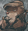
Sometimes I feel like doing something a little less painterly and a little more graphic. Flat colors can be really nice?
Category Artwork (Digital) / Scenery
Species Canine (Other)
Size 470 x 835px
File Size 209.3 kB


Thanks! I kinda felt like doing something with super-rough (ie, lazy) linework that I could just scrawl out at top speed and throw some color on to make it look like the rough linework fit. I blocked out the scene roughly first, but then I think the pencil work itself took about 3 minutes and 15 seconds <3

I have a ton of respect for graphic artists who can maintain the free, quick energy of sketched lines while creating balanced, refined compositions. As a generally poor inker, I tend to choke every bit of life out of my linework when I go about cleaning it up. Doing it quickly-but-correctly requires a lot of practice and a lot of confidence -- I don't have much of the latter at all, so I figured I'd use this as a chance to get more of the former ^_^ Thanks for the comment!

Aww, yay <3
I liked the idea that even animal people who wear clothes and play instruments and work in the city still live off in the woods someplace ^_^ And yeah, I'd been doing a lot of painty stuff recently, so I figured I'd do something a little more graphic/iconic than representational for a change.
D'you have spooky fun at the con? Do good business? I'm always stoked to see more from you <3

dude, digging those brush-esque lines.
flat, graphic design-ey things are great - especially when done right. it's easier to incorporate text into the images, and the "style" of the image is often neutral enough to appeal to a broader audience than others :3a
eh I don't even know what I'm saying anymore. but I loooove multicolored strips on clothing.
Totally re: the broader audience thing. I think it takes on a kind of editorial quality -- this could be used as a general piece about commuting, where the woods and the city are just metaphors. It's a little vague about the statement it's making (because I didn't really intend it as commentary on commuting, haha), but it's definitely got a lot more crossover appeal than, say, the naked rabbit dude and the lotus. With that, the first logical question becomes, "Okay, why is he a rabbit?" You just don't get that with graphic stuff like this.
And I totally thought of adding text to this, but couldn't come up with anything to really add, so OH WELL!
Also, stripes are rad!
And I totally thought of adding text to this, but couldn't come up with anything to really add, so OH WELL!
Also, stripes are rad!
haha well, not just subject matter but like.
If it was a really photorealistic image, or say a painterly image. People become more occupied with image and then they start questioning what they're seeing. You could have a rabbit guy in stylish clothes standing in some mall or whatnot in a flat, graphic-designey look and people will go "oh okay that's just personas and it's cartooney to make it look more appealing and interesting". Once you make the dude look like an actual rabbit-person people go "what, why is he a rabbit? what is this?"
If it was a really photorealistic image, or say a painterly image. People become more occupied with image and then they start questioning what they're seeing. You could have a rabbit guy in stylish clothes standing in some mall or whatnot in a flat, graphic-designey look and people will go "oh okay that's just personas and it's cartooney to make it look more appealing and interesting". Once you make the dude look like an actual rabbit-person people go "what, why is he a rabbit? what is this?"
Pretty much totally exactly what I was talking about <3 I think there's just more of a context for visual metaphor in flat, graphic work than in realistically rendered painterly work, too. There's the body of cartoon animation in the Warner Brother/Disney mold, plus all the wacky advertising mascot characters, etc. to draw context from in the design arena. The painterly tradition is all human figure stuff, so animal-men seem out of context. The fact that you're changing the subject matter becomes important, and begs the question of why you're turning the people into animals. With graphic stuff, the question never really arises to begin with.

man, this could be a neat poster. wait, it IS a neat poster.
I really like the colors and the composition
did you watched this on my journal ?
music posters, link courtesy of my design teacher
http://wellmedicated.com/inspiratio.....re-to-inspire/
I really like the colors and the composition
did you watched this on my journal ?
music posters, link courtesy of my design teacher
http://wellmedicated.com/inspiratio.....re-to-inspire/
Those are totally sweet! Haha, and they're totally a cross-section of the music I listen to <3
I agree with the one commenter who says the list is missing stuff by Aesthetic Apparatus -- they're a Twin Cities duo that does awesome screenprinted poster work! If you haven't seen their stuff, definitely check it out ^_^
I agree with the one commenter who says the list is missing stuff by Aesthetic Apparatus -- they're a Twin Cities duo that does awesome screenprinted poster work! If you haven't seen their stuff, definitely check it out ^_^


I tried to pair the more editorial style with more referential than representative imagery, hence the mini-skyscraper, etc. There's definitely room there to expand or contract your interpretation to anything from "a commentary on commuting in general" to just "some folks are going to work here." Make of it what you will ^_^


The brush I always use for everything has the following settings:
Spacing: 2%
Other Dynamics > Opacity Jitter: 0% set to Pen Pressure
Smoothing: checked
And the shape of it is just this kind of rough, mostly opaque wedge
In cases like this one with flat colors, I just hammer on the pressure, but when I paint normally, all my blending happens by just varying the pressure in my stroke.
And yeah, something different! Every so often, a little departure is fun ^_^


Thanks! I like to draw animal people because I like to draw animals and people -- it sounds obvious, but it still holds true. Animals have really nifty forms and expressions of their own, so I usually try to change as little as necessary to get my point across.
I also love toony stuff, don't get me wrong, it's just never been something that came easily to me ^_^
I also love toony stuff, don't get me wrong, it's just never been something that came easily to me ^_^


Comments