 FA+
FA+
427
Views
Views
48
Favorites
Favorites
Category
Artwork (Digital) / General Furry Art
Species Bat
Size 1000 x 1000
File Size 1009 kB
Report this content
More from Defiance


Listed in Folders


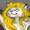
A two-hour Frozen-Inspired piece of Nyxis lightning bending.
I've been meaning to draw Nyxis using her magic, and this Ask question gave me the perfect opportunity to do it:
For Ms. Pierce. It is said you have mastered the art of magic in the form of lightning. Can you conduct it through metal? And is your sword insulated or can you conduct lightning through that as well?
General Pierce: The simplest definition of element-bending is being in control of an area of atoms around you. As you train, you increase the number of atoms you can reach and...
http://ask.fm/BatGeneral/answer/124583327780
Category Artwork (Digital) / General Furry Art
Species Bat
Size 1000 x 1000px
File Size 1009 kB
Listed in Folders


The air glows white on the mount tonight, as it crackles and it gleams...
The rocks are fused together and obsidian in sheen...
The air is booming as it heats up and contracts...
Thunder the result of these science facts...
Don't let them near or let them see,
it'll fry their eyes out, certainly...
Contain, restrain, don't let it flow... Well, fuck it, bro... Let it glow!
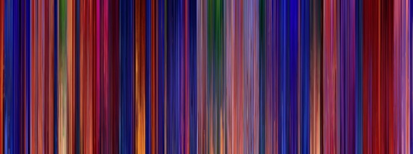
(It's certainly magenta and cyan enough to pass for a film still, innit?)
The rocks are fused together and obsidian in sheen...
The air is booming as it heats up and contracts...
Thunder the result of these science facts...
Don't let them near or let them see,
it'll fry their eyes out, certainly...
Contain, restrain, don't let it flow... Well, fuck it, bro... Let it glow!
(It's certainly magenta and cyan enough to pass for a film still, innit?)
Oh god, me too. I'm a tetrachromat and am deeply aware of how much subtlety and power I'm unable to paint (besides the hues I avoid, like cadmium lemon or cobalt blue, because they irritate my eyes).
Hmm... film colors? I'd say to look through some art of books, or take notes on general color schemes in film. As an animator, damn near all of my examples will be animation.
I just watched "Frozen" again for a cinema slapdown, and took notes on the color design - magenta and cyan for accent colors, red for the castle, and the only yellow in the entire film is reserved for the climax scene at the ice palace. This is another good common tactic, is to reserve a color to only use during one specific scene – exempli gratia Pocahontas, where they made a conscious effort to not use red until the “Savages” sequence, and for the climax of “Colors of the Wind.” They managed to restrain themselves from using red all throughout the rest of the picture, they said that was the impetus.
You’ll also work with contemporary fashion. “The Incredibles” was in the early 2000s (EVERYTHING HAD SO MUCH VERKAKTE RED IN IT), so instead of the villain being red or purple (as always), the heroes had red in their design and the villain had cyan for a complementary accent color.
Christopher Nolan has almost everything be too charcoal for its own good… and then tiny specks of saturation where he wants it. His movies are great. As a rule of thumb, look for the directors like Nolan or Wes Anderson or whoever who behave like absolute dictators on set. They have the weirdest ideas.
Then there are entire films that use one color in their design. "Amadeus" is like fifty hues of White. White people, white rooms, white clothes, white papers, white everything. "Spirited Away" was designed, they mention, with such a constant barrage of red to make the bathhouse seem unsettling to the audience.
"Fantastic Mr. Fox" uses red, yellow, black and white as its poles and apparently never deviates from them except where necessary - a couple of touches of green and purple do appear to balance an image every so often, but they take advantage of this for contrast - the foxes have blue and green eyes so they stand out, the night sky is so blue it makes everything else seem oranger, and Kristofferson is given the cerulean shirt to make him look like he's in the wrong movie. That's it. Everything else is orange.
"Aladdin," Richard van der Wende basically staged the entire movie as a conflict between “good” ultramarine and “bad” red. Gold was neutral evil, green “refreshing.” White, I don’t know. But he assigned red to the villains and different shades of blue to the heroes… The Genie’s cobalt is reserved only for him, ditto Jasmine’s turquoise. http://www.cartoonbrew.com/wp-conte.....in-580x217.jpg Here’s the “summary” of every shot in the film.
For some links –
https://one1more2time3.wordpress.co...../19/color-1-1/ Here’s Hans Bacher, production designer for “Balto,” “Mulan,” and the first drafts of “Beauty and the Beast,” also designed the “Circle of Life” sequence for “The Lion King,” talking about Balto and how much of a bitch it is to design a film set in winter and not have everything be blue a ba dee a ba di.
http://theabyssgazes.blogspot.ch/20.....ease-stop.html Teal and Orange, the most common scourge of the earth over the last few years. Luckily it’s being superseded by the red and blue we left in the nineties… a scheme which I don’t hate yet.
http://colorfulanimationexpressions.blogspot.com/ The blog I was building to this whole time – Oswald Iten’s master blog about everything about color in film. Along the top he has some incredibly good analyses of “101 Dalmatians” and “Fantastic Mr. Fox” that are required reading for anyone planning film colors.
Happy painting!
Aaah These will super help! ^____^ I also bought the Once Upon a Time book and it came in a week or two ago; there has just been no time to look through it myself.
I take ALL THE ADVICE to heart, so thank you again!
I take ALL THE ADVICE to heart, so thank you again!
Oh, that? It's... interesting. Lots of great art on the display, and some insightful commentary, but you get the sickening sense throughout about the author going "The Lady doth protest too much," and the constant interplay between the Disney images and the "fine arts" images doesn't appear, after the fiftieth one of each, to be a serious artistic parallel as much as a desperate attempt to give the films a legitimacy... he writes as if, instead of the Disney Studios, he was trying to make excuses for the goddamn Care Bears.
*breathes*
Sorry, it's just a raw subject. I get into enough arguments with my friends about the critical legitimacy of the medium, and I find that book to be a hugely squandered opportunity. Just treading water, red page after red page.
THAT said, politics aside, it's an INCREDIBLE book in the sense that you want to DRAW after reading it. Lots of great examples of old-timey illustration that I adore so. It's definitely worth the money for the illustrations alone. Let it fire your brain. So many good ideas throughout. Go. Face the problem. Fight! WIN! And call me when you get back darling, I enjoy our visits.

Interesting. In context I suppose it is the same for Aerth. At first he can only control air pressure differentials directly in contact with his body, but as he trains his "reach" expands. By the end of his career he can throw up walls of turbulence to slow down or deter fast moving objects, "pop" enclosed rooms if he's inside them, explode pressurized objects a few feet away from him, and generate brief but intense gusts of hurricane force winds. He also becomes skilled at the art of "pressure pillowing" or using air pressure to cushion high velocity impacts.
Comments