 FA+
FA+
2349
Views
Views
128
Favorites
Favorites
Category
All / All
Species Unspecified / Any
Size 938 x 1963
File Size 1.48 MB
Report this content
More from lapinbeau


Listed in Folders


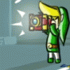
Trying to figure out how to emulate a "storybook" style of art.
The texture helps, but... I dunno.... something still feels slightly off to me. Not sure what.
And yes, I know the aliased line art detracts. >.< I'm still trying to wean myself off of that.
Damn it, I need an art tutor. :(
CONSTRUCTIVE FEEDBACK/SUGGESTIONS APPRECIATED.
The texture helps, but... I dunno.... something still feels slightly off to me. Not sure what.
And yes, I know the aliased line art detracts. >.< I'm still trying to wean myself off of that.
Damn it, I need an art tutor. :(
CONSTRUCTIVE FEEDBACK/SUGGESTIONS APPRECIATED.
Category All / All
Species Unspecified / Any
Size 938 x 1963px
File Size 1.48 MB

Y'know, I'm looking at this and something keeps trying to pop itself up. I think if you used a thicker outline for the whole silhouette, you'd get that storybook style. It seems like every Dr Seuss and Shel Silverstein I read, the linework was THICK around the character's silhouette and thinner on the details.

you could try it out on this one already, using the magic wand to select the entire character, then switch to a layer below the character art, increment the size of the selection by a few pixels and then fill it with black.
Loses accuracy on sharp corners with most selection tools though so those need a touchup to look pointy again.
Loses accuracy on sharp corners with most selection tools though so those need a touchup to look pointy again.


Sharper shading, maybe? Less naturally smooth, more cartoony. The cloth curves already concisely illustrate detail without obsessively accurate highlights. You've got the right perspective down - negligible foreshortening from a 45-degree angle, to focus on pose and objective shape.
Maybe a print texture instead of a paper filter? CMYK dots, y'know, like when you zoom in on a newspaper. Maybe just reduce contrast by whitening up everything but the black outlines. Or say you're using a few specific inks per-character and blend each region with white - fuschia vs. white and indigo vs. white on the costume, olive vs. white on the leather, ash vs. white on the trim / makeup.
Little Golden Books of cardboard jester smut would make excellent con merch. >.>


Looking at the head, I feel like the face wants to be a different texture from the clothes. The texture gives the colours on the clothes some cool depth.
Looking a the scaled down version the face texture looks better, it actually might be just the shadow under the hair. The brighter wrinkles stick out a bit when viewed at full size.
Looking a the scaled down version the face texture looks better, it actually might be just the shadow under the hair. The brighter wrinkles stick out a bit when viewed at full size.
Oh yeah, I can see that now that you mention it. I noticed it was a different colour than the actual shadow, but it didn't click for some reason :shrug:
It has been real cool to watch you try new things and keep working to improve your skills. Thanks for sharing your experience and good luck.
It has been real cool to watch you try new things and keep working to improve your skills. Thanks for sharing your experience and good luck.


Comments