 FA+
FA+


")
")
")
")


See the actual picture here: https://www.weasyl.com/submission/8.....06/skal-tel-1h
I will be posting this tomorrow on FA though. Will be scraping once original is posted.
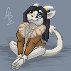
This is a commission for Skal-Tel of his kickass argonian character
Really pleased with this one and really shows I'm getting the hang of these smaller portraits
Break down was roughly:
sketch-15minutes
base color- 2-5Minutes
detail colors- 35ishminutes
Special effects(background/highlights/dust)-10 minutes
I will be posting this tomorrow on FA though. Will be scraping once original is posted.
This is a commission for
 Skal-Tel of his kickass argonian character
Really pleased with this one and really shows I'm getting the hang of these smaller portraits
Break down was roughly:
sketch-15minutes
base color- 2-5Minutes
detail colors- 35ishminutes
Special effects(background/highlights/dust)-10 minutes
Category All / All
Species Unspecified / Any
Size 682 x 527px
File Size 1.6 MB


Ask away!
If you're specifically asking how I made the gif, I used a free gif making I found on google.
The actually piece was made in photoshop, mostly using a mid-soft round brush. Used an overlay later for the fancy highlights, and a couple of texture brushes for the bg and for the "dust"
If you're specifically asking how I made the gif, I used a free gif making I found on google.
The actually piece was made in photoshop, mostly using a mid-soft round brush. Used an overlay later for the fancy highlights, and a couple of texture brushes for the bg and for the "dust"
Actually you can make a Gif in Photoshop. That's how I've made some of my Avatars. I can tell you if you want. Or you can google it also XD
And Great! I'm always trying to learn how to improve my art and your art will help me soo much.
One thing that I like to use with scales is overlay. It really pops out the scales soo much. Now here's the question
On the second image you have of course the colors added to it as well as the shades. I'm guessing you but the color on a bottom layer and then the shades on top of it. Did you us an overlay for the shades as well, a different modifier, or did you use darker colors for shading?
It looks like you blended or smoothed some of the colors from the second and third one. Did you just a tool? or just carefully used the smear tool.
At the same time I noticed the outline became smaller. Did you move the outline to the back? Or how exactly did you do that part?
How did you do that excellent job with the eye.
Ok and the last part with the highlights you did at the end. I'm guessing you used an overlay with that as well. I notice it has a kind of yellow hue to it. Did you use light yellow color?
Sorry about all the questions about it. But I love to learn new stuff. And usually tutorials don't help me that much since I can't ask it questions XD Thanks for your time
I'm answering on my phone, so apologize in advance for weird typos..
Pretty much my main process is(and pretty much what you are seeing is):
1. sketch it out w/ scale pattern
2. Add flats and basic highlights under sketch( I paint in highlighlights, otherwise the flats will serve as my midtone)
3. Add a layer on top of sketch and begin to paint the details. I paint directly on top of the sketch. I will later erase rough bits of the sketch poking out where I don't want, though it's better to use a layer mask, since then you aren't accidentally loosing something you need. It only appears to shrink the sketch, it that's actually how I clean the sketch up. Sketch usually serves as my darkest darks and helps define certain aspects. I also rarely use a total black for y sketches for this reason or will set my sketches to multiply
4. Add a background using various trxture brushes then blurring them out using "guassion blur" and adjust it so the bg isn't main focus but some texture still comes through.
5. Use the dodge and burn tool to get some depth and put focus in bg where I need it
6. At this point I will usually make a new layer, "apply image" and have everything on one layer, with some paintings I'll work totally on one later from that point on or will add effects then apply image again
7. New layer set to overlay, I will do a light wash of color to boost a given highlight effect, for this is did use a light low saturated gold color
8.two New layers-added"dust" using a speckle brush I have, then put them through "motion blur." 2 layers to have different amounts of blur and sizes, then combined them
9. This will be the last adjustment phase. Usually it'll be a final overlay layer to make specific things pop with a bit of white
My process is a bit different between pics, buts that's pretty much my core process for just about everything, character wise that I'll do. Only thing I did with this one that I do differently with non scaled characters is draw a scale pattern in with the sketch
To answer some of your questions specifically:
The eye: I just thought about how light would hit it so added a base nightlight accordingly, then painted over it..practice painting several eyes using real reference and eventually you'll know what to do..always always use photo reference. I like my eyes to pop a bit with these smaller commissions so I will often use the sponge tool to make it a little more saterated the the rest of the pic in the end.
The outline: as stated above I actually just paint on too of the sketch, I'm way to lazy to outline my sketches, so I try to make them as clean as I need theme he first go round and will usually fix things as I go.
Smudge tool: to blend I'll either use alow opacity, soft brush or a special blending tool I made. Basically...a normal brush with a little scattering added. It will make the smudge tool your absolute best friend when blending, stupid simple technique, but amazing outcome.
I think I answered everything..?
A few things to consider: for a long while I was considered a mainly scalie artist, so I got a lot of practice drawing scales. I like to paint them in indevidually and shade as I go.
I also have in mind my lights source from the get go. I usually sit and think about what I want the end result looking like before I've ever put down any color. It's part of the reason I will paint in the highlights with the flats. I need to save time, so guessing about light later down the line isn't an option. I also know light is very bouncey. Huge mistake that's very common among newer artists is making their darks waaayyyy to dark. Unless it's really harsh light there will almost always be light bounced up on the shades areas. Finding really good photoreferenxes can help guide you till you can make an educated guess on your own later/in time. Drawing from great photo refs is always a great idea and really good practice. I will always always always look up various photos to get poses, lighting, shape and what have you for ideas and methods to look at. Anytime I question myself I can look to the references for help.
The hardest characters I come across are imagined critters and I'll usually combine actual animals to make them. Otherwise it's just experience and practice of what looks good and what doesn't.
Anyways hope that helps..? One thing to know is there really is no right and wrong way to do things. Do what your comfortable with and adapt your style to make it work for you. :)


Comments