 FA+
FA+
1845
Views
Views
184
Favorites
Favorites
Category
Artwork (Digital) / General Furry Art
Species Bear (Other)
Size 680 x 850
File Size 357.6 kB
Report this content
More from SpiritCreations


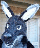
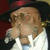
Commission for the sweet-as-honey Bjorn Grafeldr. I love bears! Why aren't more of you guys bears? :) I sepia-ized the picture to give more of a feel to the time period, as well as added in details no one will see until you have the high-res version, such as words on the pages of the book. :) What a very fun piece to do! Bjorn sure does have an interesting back story of his character. What is he reading, and why is he studying it so intently? Read his story and find out!
Bjorn Grafeldr © his respective player 2008
Art © S. Henson 2008
Bjorn Grafeldr © his respective player 2008
Art © S. Henson 2008
Category Artwork (Digital) / General Furry Art
Species Bear (Other)
Size 680 x 850px
File Size 357.6 kB


lol I bet more of these guys are "bears" than you realize fuzzbutt
You really are turning out beautiful work these days. IMO furry's time is coming, I wouldn't be surprised to see tasteful works like this hanging in living rooms, purchased by fans of Avant Garde art. It just needs the right marketing. God, I just wanna see you become a commercial success! This picture is good enough to hang on a wall, as are most of your other works. No shit.
You really are turning out beautiful work these days. IMO furry's time is coming, I wouldn't be surprised to see tasteful works like this hanging in living rooms, purchased by fans of Avant Garde art. It just needs the right marketing. God, I just wanna see you become a commercial success! This picture is good enough to hang on a wall, as are most of your other works. No shit.


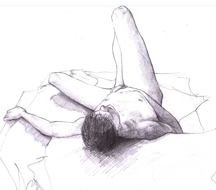
The way you render forum and fur is awesome. But I have to say that my favorite part of the drawing is the background, with the illusions of books.
I think the reason why I like them so much is because there are no lines defining them, it's all value and shape. You created an outline line with your character, which gives him the appearance of making him two dimensional.
But that's not a problem. There are some great figure drawing artists that outline their work and still creates depth.
http://www.rebeccakimmel.com/galler.....-Demo_01_A.jpg
http://www.artshole.co.uk/arts/arti.....-Drawing-2.jpg
This person outlines a bit on the leg and it's cool and all as well as the other figure, but I think that it's more interesting to get an overall impression with values and such and have the lines naturally form on the viewers eye by themselves.
http://www.ianhopton.com/Life_drawi.....s/art/nude.jpg
Sorry for the crappy reference photos. I wanted to show this specific image that I couldn't find.
Many artists have this problem, and it's one of the hardest things to overcome, to get rid of line. Even some professionals do it, and they end up suffering in the end.
It could be a new small thing you can play with to see what you can do!
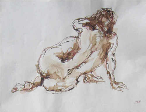


Oooh, books!
What? Oh, right! This is a very nice piece of work, on several different levels. The lines and colors are crisp and clear where they need to be, allowing me to see the wealth of detail that you put into this illustration even though it has that pleasantly shadowy look that any good library/sitting room needs to get that cozy, protected feeling. I also like the way that a sepia tone was used without overpowering the rest of the colors. As you said, this makes it more "period," but I also find it enhances the feeling of warmth. The clothing and character are, of course, really well-drawn, complete with slightly loosened necktie.
Oh, and there are books. I want a room like this in my home, if I'm lucky enough to have the option.

This is just.......wow. I can't believe I hadn't commented on it til now. But.......first off, great job on the warmth of the pic. The bear looks like he does this for a living. And enjoys it. He looks like how imagined my Uncle would have been if he had been healthier and wealthier. Going through his personal library, wearing some old fashioned outfit, and always having a severe look on his face....or in this case, muzzle. The pocket watch sealed the deal on that thought. Once again great work and keep it up.

Comments