 FA+
FA+
561
Views
Views
10
Favorites
Favorites
Category
Artwork (Digital) / General Furry Art
Species Lizard
Size 1024 x 745
File Size 107.3 kB
Report this content
More from Phoenix


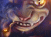
Kind of an experiment in lighting, which didn't turn out all super-cool like I'd hoped, but still... After so long since my last big colored piece, I'm just glad I got the picture done. The depth-of-field blur effect was another experiment I wanted to do for a while now, also didn't turn out as well as I wanted, but not too bad, at least.
Anyway, this is taken from my current SF/fantasy-mix RP campaign with my friends. The lizard there in focus is Misha, who has become something of an occassional partying companion of one of the PCs. She's all done up in scale paintings, a fairly simple one in this example, but one featuring some luminescient paints to add more to the show (The artist at that club is particularly known for such work). She, of course, was quite happy to use it to acentuate several particular parts of the anatomy. And those stripes put off a pretty good glow, you should see her in the bedroom when that's the only light there is...
Incidentally, the little kobold to her right is another NPC, Keelan, who is quite heavily interested in another PC (He's in love, awww). Though you can't really make him out too well there :>
Was originally going to be mature for nudity, but the combination of shadows, blur, and glow rather adequately censor any naughtiness. Sorry.
Category Artwork (Digital) / General Furry Art
Species Lizard
Size 1024 x 745px
File Size 107.3 kB


On my display, this image is too dark to even tell what it is. And I know from experience a lot of people's displays are darker than mine. What little I could see looked like deformed human ghosts swaying.
I altered the image to be able to see what it was, and it's an awesome picture. I really like this.
Images at the edge of the dynamic range are problematic because of variances in the different display screens out there. You'll find that this image looks very different (and often ruined, like on mine) on different displays besides the one you composed it on.
Might I suggest uploading an adjusted version of this image? Lighten the dark areas. The light areas are good where they are. This will reduce the overall contrast in the piece, but you should be able to still achieve the desired effect. Just the main thing is that the elements our eyes need to distinguish shapes must not fall entirely in the edges of the dynamic range or many displays will wash them out completely to the point of being unrecognizable.
The idea of naked dancing reptiles in the dark is also really hot. I'd love to be able to see their naughty bits. Especially if the idea was to accentuate them with the paint.
I really love your work by the way. I'm always excited to see when you've posted something new. :)

Seconding this. My monitors are pretty well calibrated and I can't quite make out what's going on unless I take it into photoshop and turn the levels way up.
It's a neat effect though, and a good picture, good setting of mood. Looking at the version with the levels turned up, it's clear you put a lot of work into the pic, lots of details that get lost with it being too dark.
It's a neat effect though, and a good picture, good setting of mood. Looking at the version with the levels turned up, it's clear you put a lot of work into the pic, lots of details that get lost with it being too dark.
Yeah, I run into the problem a lot. I tend to have a lot of pictures with fairly dark coloration themes, and it seems half the people see them as too dark, while half see them as washed out. Kinda frustrating consider I check it on a couple displays before posting it, even... Even on the LCD with the contrast, brightness, and gamma turned down as far as they went, the pic still a bit dark, but you could still see what was going on. Only way it looks really too dark is if I crank my desktop gamma way down, but then -everything- looks too dark.
I'll have to mess around with a few things, see what I can get...
I'll have to mess around with a few things, see what I can get...
I think the actual issue is that you're trying to push too much contrast in the images. I know how that is. It's something I've been learning to get away from in my own artwork. Trying to give it that really crisp punch because anything less seems washed out.
But basically what happens is we end up asking for more dynamic range out of the display than it can really do. And then that's where the variations in displays really show up because they're being pushed to the very limits of their dynamic range performance.
In essence, we try to make up for the lack of contrast range in the display by boosting the heck out of the contrast in the image to compensate. It's like pumping up the bass in an audio recording to compensate for tinny cheap speakers... it doesn't really work, and it just makes it all muddy.
The method I've found that works well for me to avoid doing this is actually other artist's pictures. That is, I use other artists pictures which are known good references as my 'brightness and contrast' reference. I flip through a few of those and then to my image and see if it fits in with the others... or if it looks more washed out or more severe by comparison. Seems to work pretty well.

Comments