 FA+
FA+
764
Views
Views
12
Favorites
Favorites
Category
All / All
Species Unspecified / Any
Size 589 x 864
File Size 407.8 kB
Report this content
More from Ovek


Will delete submissions after but until then:
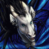
Trying to settle on a cover for my first comicbook issue of Chamboy's Universe.
You guys can help by voting/input
From top left to right respectively:
A B
C D
Trying to settle on a cover for my first comicbook issue of Chamboy's Universe.
You guys can help by voting/input
From top left to right respectively:
A B
C D
Category All / All
Species Unspecified / Any
Size 589 x 864px
File Size 407.8 kB


thanks for the votes yo~
Yeah, B is actually the least favored one so I'll prob use that for a diff purpose than a cover. I'm very curious as to what would make a good first impression w/o giving away too much of the story but have it still relevant to the story. But most of all, have it look appealing. So I'm just guessing, but I guess ppl might like certain ones based on how familiar it is to them.
Yeah, B is actually the least favored one so I'll prob use that for a diff purpose than a cover. I'm very curious as to what would make a good first impression w/o giving away too much of the story but have it still relevant to the story. But most of all, have it look appealing. So I'm just guessing, but I guess ppl might like certain ones based on how familiar it is to them.


D will probably be used for the next issue after the first (if I get that far HUHUHUHU) and in terms of first impression, a lot of ppl have been leaning towards A/C as a first issue. Interestingly, A was redone from the angle that you suggested but it seem to reveal too much of the character than I preferred. The pose will need to be tweaked a bit b/c it was the initial pose of another sketch that needed it composed that way, but since I'll be working with elastic materials, I can focus on changing them a bit more.
Thanks for voting yo~
Thanks for voting yo~

Hmmm, wish I could understand a bit more with C. But if I can vote, D looks more proper for a cover page of a comic, that´s for sure.
Though let´s see... in B I suggest on putting the title bellow, because that space is calling attention too much XP and it´s like a propoer place to put the title of the story.
A looks more creative and dinamic, but I recommend you to give some spaces on the edge of the canvas, the letters are pretty much close to the edges, and from what I learn, if you send them to print, the printer could take few mm or even cm of space from the edges of the file.
That should be the suggestions I could give, but D could work better XD Good luck
in C, he's just behind a fence and seemingly trapped. And B is out of the running for being a cover but I'll prob use it for a header instead.
As for A, thanks for the informations, I would have prob ran into complications if this wasn't addressed haha~
Thanks for voting~
As for A, thanks for the informations, I would have prob ran into complications if this wasn't addressed haha~
Thanks for voting~


Comments