 FA+
FA+


185 submissions


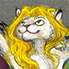
Another gifty thing! It's been nice having a bit of free time before work grinds back up for the year, and  SwigMama's work is always an inspiration, so I figured I'd paint up the adorable Sighs and Red taking a little break mid-jog.
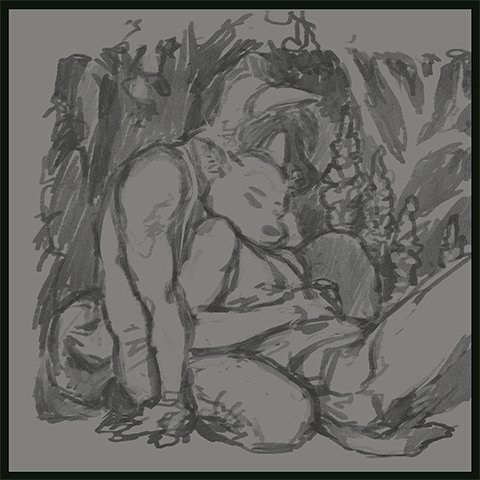
They also gave me a fun excuse to try my hand at a little homage to Frank Brangwyn, whose thick, juicy paint handling totally revs my engine. He has a couple of pieces with fun dappled lighting and neon nasturtiums, so credit for those goes to him <3
 SwigMama's work is always an inspiration, so I figured I'd paint up the adorable Sighs and Red taking a little break mid-jog.
They also gave me a fun excuse to try my hand at a little homage to Frank Brangwyn, whose thick, juicy paint handling totally revs my engine. He has a couple of pieces with fun dappled lighting and neon nasturtiums, so credit for those goes to him <3
Category Artwork (Digital) / All
Species Dog (Other)
Size 830 x 840px
File Size 277.5 kB

I hear you! I had my own "that guy" before I got to where I am now, and I have twice as many that guys now to keep me motivated to keep at it. It sounds cheezy, but you only get to be that guy by listening to the part of you that gets motivated by pretty stuff and ignoring the part that doesn't
The best tip I ever got from a friend was if you're gonna do that, do it from someone obscure. Not because you're gonna rip them off, but because it adds a layer of urgency to the piece - i.e. "If I don't copy this great idea/pose/color scheme she had, people won't know it was there."
http://animationresources.org/?p=587 Mine was this guy... who was yours?
http://animationresources.org/?p=587 Mine was this guy... who was yours?

Mine were the comic strips in the daily newspapers, the black & white illustrated “novels”, and the artists who drew the “Conan the Barbarian” monthly large comic books. The people who knew how tell a story with their drawings.
Then later, the Old Masters who also told stories through eye-catching beauty or down-to-earth realism. If I had to single out particular artists then they would be Caravaggio, Rembrandt and a newer “Old Master“, Norman Rockwell.
Whenever I see an artist whose work catches my eye, I ask myself two questions; First, ’could I do this (the picture)?’ And secondly, ‘Could I do the same thing, but only differently?’ I may not succeed in my attempt, but I learn a little bit more in the way of art knowledge from making the attempt -- and I am grateful to that artist for “providing me with an art lesson“.
Bravo to all of this. ^u^
Ah, memories of analysing "Calvin and Hobbes" strips as a kid... ^^ And I'm with you that people don't know how to imply stories with their drawings anymore. (Cheers to a fellow Rockwell appreciator. He could make the stories so clear that people debate his art for story purposes and not even notice the storytelling and gorgeous treatment of light. I always say that if the artist is talented, you can take an extreme close-up of a random part and it'll make a gorgeous abstract piece, and Rockwell is hugely good at that. Only thing is, when I was a kid I was afraid of his characters' hands. XD)
It's a journey, man <3
Allow me to use your kind comment to post a number of links to my own Old Master-inspired works to illustrate my points:
VENUS RISING (Botticelli)
http://www.furaffinity.net/view/257986/
RHEMBRANTISH Portrait
http://www.furaffinity.net/view/292040/
SAINT JOHN THE BAPTIST (Caravaggio)
http://www.furaffinity.net/view/5177816/
YOUTH WITH A RAM (Caravaggio)
http://www.furaffinity.net/view/10705032/
FREEDOM OF SPEECH (Rockwell)
http://www.furaffinity.net/view/256897/
[Kamui is free to delete this comment as he wishes without offering offense since this is HIS page.]
Bravo to this! Analyzing your compositional choices... And glad to hear you're a fellow Caravaggio fan. Few people have ever had his command of light and tone. His compositions slay me... you ever see his Portrait of Bacchus, it's got so much torque despite its classical composition...
And the Franz Hals piece is rather nice! (I'm Dutch, you don't have to call everything we do "Rembrandtish" XD Jan Steen is, for those piercing poses and light setups, my personal fave Dutch Old Master (not counting Rembrandt, who's in a class by himself).
I really don't have any good style parodies, much less copies... usually I see something I like and try to integrate that into a picture. http://www.furaffinity.net/view/12255834/ This started as a parody of the busy compositions and Scandinavian textures and profiles and undulating cloud patterns of Kay Nielsen, but it doesn't look anything like his work. (I put 25 hours of work into that piece for 35 views, is this what writers feel like?)
The guys I do try to imitate are more in the region of Illustrators (Edmund Dulac, Kay Nielsen, Jiri Trnka, Mirko Hanak), cartoonists (Peter Arno, William Steig, Jack Cole, Elton Dedini, Erich Sokol, Chuck Jones, Willard Mullins), and "I don't know where to put'ems" (Claire Wendling, Qin Tianzhu, Liu Jiyou, Norman Rockwell, Heinz Edelmann, Marc Davis, Bob Peak, Gerald Scarfe, Jan Lenica). There's not many 'famous' pieces to imitate, so I do style studies and compositional notes and trace over the work to gauge thought process... Often, I read about the way an afrtist drew, what their thought process was (drawing from the wrist vs. arm vs. chinese style pen holding, color layer order, etc.).
As for the Rockwell fandom, I think you'd like this - http://illustrationart.blogspot.com.....ls-part-6.html This blog is one of the awesomest things ever, too. I've read the archive to the beginning...
But seriously? Yasuo Kuniyoshi? His work is probably the gray polar opposite of strongly patriotic propaganda pieces, what possessed him to even be considered? XD
Went to the Rockwell blog and enjoyed the discourse there, especially regarding Rockwell’s encounter with Archibald MacLeish. That latter again pointed out the vast gulf that exists between art for popular appreciation and that seeking approval from narrow self-regarding intellectualism. Rather like the difference that exists between the People’s Choice Awards and the Academy Awards.
As a pompous twat myself (hell, I was drawing a Wagner opera back there), I must say we can be pretty full of it sometimes ^^"
As an animation student, you don't need to tell me twice!
(Seriously, Hollywood hates us. XD http://www.cartoonbrew.com/business.....lms-87489.html They've added in rules for the Golden Globes for the express purpose of keeping animation out. You hear Randy Newman's incidental score to "Princess and the Frog?" It's one of the best scores of the year, but after Alan Menken, they hurriedly instituted a rule that you can't submit a score if there's more than two songs in the film. Poof, no nomination!)
While I can appreciate the unique solutions to the technical problems of acting, directing, lighting, and the myriad other tasks involved in making a movie (I am usually the very last person out of the theater since I stay to look at ALL the end-of-the-movie credits), the Academy Awards only reluctantly accepted animation, computer generated “actors”, and special effects as being legitimate parts of the story-telling art (unless of course they have George Clooney in them).
As for music … John Williams, perhaps one of the most prodigious current-day movie music composers, has been nominated 45 times for an Academy Award, but only received 5. I doubt Wagner or Tchaikovsky would have even been nominated.
As for music … John Williams, perhaps one of the most prodigious current-day movie music composers, has been nominated 45 times for an Academy Award, but only received 5. I doubt Wagner or Tchaikovsky would have even been nominated.
They usually don't know shit about the technology involved... Tron wasn't even nominated for the SFX, because back then the academy complained to them that 'using computers to do the work for you is cheating..." What did they think, it was done by robots? Ang Lee doesn't even acknowledge the fact that Richard Parker was even eligible, much less the best actor of the year.
(Hell, Criterion only released the first animation DVD in 20 years because it had Wes Anderson in the director's seat.)
Williams, man. You can't really win everything... five academy awards is more than most people will ever get, and even making 1 out of 9 is nothing to sneeze at (99% of actors don't even make that). As a massive Wagner nerd, I can tell you, he would have been nominated by the fervent admirers in the academy, but would never have won, people would complain about the music. XD


They are p. supreme degs UωU And that's really sweet, dude, thanks! I am definitely a sucker for Tender Moments™, though I worry sometimes that, if left unchecked, I will become a sort of Thomas Kinkade of one-deg-leaning-into-another-deg's-arms-snuggling.
(But I love it.)
(But I love it.)

Ehehe, I hear ya :p. Wouldnt be as neat if it was repetitive. But! I always "http://www.furaffinity.net/view/2440083/" a story snakes its way into view by some sly channel in your stuff. And Kinkaid's a quadruple threat of Nope that you'll never be -- factory-scale profiteering, technically slipshod in a way that'd give you hives, gesturing toward the idea of Sappiness -- but also creepily completely devoid of emotion (clearly only serial killers and pedophiles live in his landscapes).


hahaha, not at all. The happy cuddle hormones are natural even if you're just watching. Trust me, I have cats :P
tbh I was being a little weird and referring to the fact that I love both of yall's art and I was like omg! A cute artist thing happened! Which is really a case in point, isn't it.
tbh I was being a little weird and referring to the fact that I love both of yall's art and I was like omg! A cute artist thing happened! Which is really a case in point, isn't it.


OOHHMYGODOHMYGODOHMYGOD I AM SO FLATTERED AND THIS IS SO UNEXPECTED IM SO EXCITED RIGHT NOW I---
THANK YOU
THANK YOU SO MUCH I NEVE RRJFJDKSJKJDS OOHGOSH i dont even know what to say
IM SO HAPPY
The lighting is gorgeous
the details of dappled lighting is breathtaking; how you used color is so gentle yet striking and creates the shapes that flow so wonderfully i just ghhdfuhudffd
thank you so much, i am for a million years, flattered.


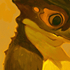


As a fellow Brangwyn fan, you captured his textures astonishingly well, and managed to synthesize your color palette with his <3 Brava!
And I saw your comment on Tumblr, wondering about how people can plan the compositions out so well beforehand? I thought you might be interested in this - http://animationresources.org/?p=2066 , a post on ink wash paintings for spots in Collier's Magazine during the '40s, that takes the opposite stance, wondering how people can keep a composition fluid without losing the strength of the piece - and the art isn't half bad! ^^
And I saw your comment on Tumblr, wondering about how people can plan the compositions out so well beforehand? I thought you might be interested in this - http://animationresources.org/?p=2066 , a post on ink wash paintings for spots in Collier's Magazine during the '40s, that takes the opposite stance, wondering how people can keep a composition fluid without losing the strength of the piece - and the art isn't half bad! ^^
Rad article! Thanks a bunch for sending that along <3 It certainly raises some interesting points, and thinking about how to tweak my painting process to make up for/overcome some of those inherent shortcomings sounds like an interesting but really worthwhile challenge.
Cheers!
Cheers!
Eh, I'm of two minds on it! If I were using digital as a way to sort of cross-train my traditional painting skills, I could see wanting to avoid developing a dependency on digital-only tools, but if I'm just a straight-up digital painter, then leaving some of those very powerful tools untouched seems like it might be cutting off my nose to spite my face. The sort of pitfalls of garbled perspective and lighting that the article mentions can certainly happen (and especially the more you use speedpainting techniques involving a modular process where you cobble together new scenes out of the pieces of existing ones), but it's also totally possible to construct a thoughtful, clear, consistent composition while still using the lasso tool freely. You just need to keep an eye on the big picture as you go, balancing and adjusting as you go.
I think because digital does have so many digital-only tools and methods (filters, textures, layers, adjustment layers, lasso, transform, etc. etc.), there's always been a temptation there to think of those as "cheats," but so far I've always come in on the side of "any medium has its advantages and its challenges, so it's all a matter of how you use it."
That said, I think we can ALL agree that being thoughtful and considered about how you initially set up an image, and having a strong idea that you stick with are good things. Putting a bit more effort in during the planning phase can only save time down the line, even if you are planning to lasso the hell out of your piece as you go <3 I'm all for it.
Oh, if you're using digital as the art you're moving towards, then absolutely! Exploit the intricacies of the medium. And yeah, that article kinda implies that collages are inherently problematic in composition terms, but they can be quite wonderful at times.
Those aren't cheats any more than blotting and bruising and wet-on-wet are cheats at watercolor. If digital could get those texture effects, I'd definitely check it out ^^
The more ludditive of the demagogues tend towards seeing all change as evil molochs, I think many people are just angry that people have avenues they didn't. I just love powerful composition too much to want to get in the habit of cutting up and pasting my artifacts around (although in small doses it would certainly help with posing difficulties), I don't want to limit my compositional skills to skills only applicable in a specific medium. You dig.
Well-put all around. ^u^ Salutem.
Yeah, it sounds like we're on the same page UwU
And like you say, I think most of the adjustments I'm/we're talking about in practical application are little things like anatomy/proportion fixes and minor pose tweaks, which have a significantly gentler impact on things like overall perspective and composition issues.
Good luck with your work!
And like you say, I think most of the adjustments I'm/we're talking about in practical application are little things like anatomy/proportion fixes and minor pose tweaks, which have a significantly gentler impact on things like overall perspective and composition issues.
Good luck with your work!
It's really cool when two artists from different disciplines find common ground... I have people who can afford oil paint who I've stolen watercolor tips from. No worrs.
Yeah, pose tweaks are so damn powerful... you hate when you have a thumbnail you're trying to draw on a new sheet of paper, and then notice that the only reason the thumbnail looked good was the ratio of... IDK, the pinky finger to the thigh to the angle of the left ear and the subtle harmonies, and you'd half to redraw half the underdrawing that took you an hour to fix that? ERGGGH, I really envy you digital guys that that doesn't come up ^u^
We're not going to rip the picture in half endlessly until it looks like a bunch of little shards, by the time you can afford a digital setup you've learned better taste than that! ^^"
You've enough good taste for that. ^u^
Anyway, it's hard to read this conversation, because I can't hear the phrase "Cut thy nose off to spite thy face" without hearing Danny Kaye sing it. http://www.youtube.com/watch?v=yIWNPprZJsw&t=0m55s If you haven't seen this film yet... The Court Jester... dear god, watch it. Watch it now. If only for the lyric "Those who try to tangle with my derring-do end up at the angle that herring do!"
Anyway, it's hard to read this conversation, because I can't hear the phrase "Cut thy nose off to spite thy face" without hearing Danny Kaye sing it. http://www.youtube.com/watch?v=yIWNPprZJsw&t=0m55s If you haven't seen this film yet... The Court Jester... dear god, watch it. Watch it now. If only for the lyric "Those who try to tangle with my derring-do end up at the angle that herring do!"
You also a Kaye fan? ^u^ I adore his work so much...
And why do I sew each new chapeau with a style they most look positivilly grim in?
Man, that movie's a damn classic if only for Glynis Johns' performance in the seduction scene. "Oh, the touch of a hand, the brush of a lip, but let's not spoil this moment!"
And why do I sew each new chapeau with a style they most look positivilly grim in?
Man, that movie's a damn classic if only for Glynis Johns' performance in the seduction scene. "Oh, the touch of a hand, the brush of a lip, but let's not spoil this moment!"

Limited palettes are definitely my security blanket. I'm slowly getting to a point where none of the hues really scare me anymore (green was always hard for me, or yellows), but I definitely still have my set habits for handling color. I guess past a point, those sorts of things become an artist's "style" or what have you, but I would like to keep exploring and pushing those boundaries some UwU
I feel you completely... as an artist who's partly colorblind and really fucking scared of color, this helped me immensely - http://www.cssdrive.com/imagepalette/index.php It's a website where you can upload images from URLs or files, and it breaks down the color scheme. It's not perfect, but it's inspiring, you can take favorite artists and keep breaking them down into color... I steal so many ideas from the masters, it's not even funny ^^"
The other two big break-outs were, if this helps, the works of Erich Sokol http://illustrationart.blogspot.com.....ich-sokol.html , who was an ideal bridge between neutrals and bold color - even his browns were nothing short of masterclass - and doing style parodies of various decades.
1997 (Cadmium red, cadmium green, cadmium orange, silver), 2003 (Burgundy, ochre, gold, white, cherrywood, olive-beige), 1990 (charcoal gray, phthalo blue, goldenrod, brown, stop, hammertime), 1962 (gray-cyan, magenta-purple, dull vermilion, orange), 1944 (Olive camo, navy blue, coral pink, gray), 1977 (avocado, harvest gold, hundreds of shades of brown, yellow-orange-white combos), 1980s (1980s), That sort of thing.
A surprising rule of thumb - colors increase in saturation during economic booms and dull during recessions (compare the late '70s to the eighties to 'recession grunge'); and during wartime the colors become more polarized and get more diverse during peacetime (so in the forties you could point and say 'blue' 'green' pink' but during the fifties we started getting robin's-egg-blues and chartreuses and multiple hard-to-name shades).
Any of this help? ^^"


Comments