![Click to change the View [EaF] 1 year and 4 months](http://d.furaffinity.net/art/zeitzbach/1385792596/1385792596.zeitzbach_1_year_4_month.png)
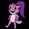
My internet went down yesterday and I had no reference to work with. I did sketch some stuffs but decided to just take a look at my old pictures instead.
OH god I want to cut myself. All loli females with big boobs. Badly flat color with half-ass shaded and no sharpening. All males must have badly down abs.
And I can't believe how I used to draw this sona. The lack of details really made him so damn hard to draw. His head was so curved.
OH god I want to cut myself. All loli females with big boobs. Badly flat color with half-ass shaded and no sharpening. All males must have badly down abs.
And I can't believe how I used to draw this sona. The lack of details really made him so damn hard to draw. His head was so curved.
Category Icons / General Furry Art
Species Gecko
Size 747 x 567px
File Size 483.3 kB
(Lol at the comments, again xD)
I indeed like the sharp design more than the curved one. I guess that doing curved faces is something every beginner likes to do. (But it kinda enlightens me why I don't like some of my character designs! I should check how I can make the curved faces a bit more edgy maybe :> )
I like the new design most, but I like the look of the drawing in the left bottom corner the most! It is really shiny, bright and has some Highlights which really work nicely!
Curved face really are easy to draw when you don't pay much attention to details. When you start thinking about the skull inside that head, it just stops there. It's just not possible unless it's a mask.
The bottom left was actually supposed to be a big pic with a really bright background unlike the other pictures but was canceled because I couldn't "feel" it. That's pretty much why it's the only bright and highlighted picture.
Good luck and have fun with improving your old designs.
The bottom left was actually supposed to be a big pic with a really bright background unlike the other pictures but was canceled because I couldn't "feel" it. That's pretty much why it's the only bright and highlighted picture.
Good luck and have fun with improving your old designs.

 FA+
FA+
![[EaF] Hollow Night 2](http://t.furaffinity.net/12229410@200-1386288156.jpg)
![[EaF] Personality](http://t.furaffinity.net/12204580@200-1386014137.jpg)
![[Doodly] Random Stuffs 2](http://t.furaffinity.net/12186019@200-1385810436.jpg)
![[Doodly] Random Stuffs 1](http://t.furaffinity.net/12172687@200-1385659829.jpg)
![[EaF] Extras](http://t.furaffinity.net/12165688@200-1385580473.jpg)
![[EaF] [WiP] Extras](http://t.furaffinity.net/12140695@200-1385299793.jpg)


Comments