 FA+
FA+
989
Views
Views
70
Favorites
Favorites
Category
Artwork (Traditional) / Fantasy
Species Elf
Size 1280 x 759
File Size 158.4 kB
Report this content
More from Leucrotta


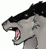
I've been trying to improve my understanding of fabric. I dunno why I felt like coloring stuff with Copics, but I did. Combining a couple of pages wound up being kinda Ravenloft-y. July 4 is sort of like Halloween, right? It's a holiday!
Category Artwork (Traditional) / Fantasy
Species Elf
Size 1280 x 759px
File Size 158.4 kB
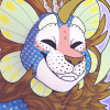


I will also add that your practice with Fabric is paying off. It looks real and natural and most importantly it doesn't dominate the picture with a 1,001 intricate details. There's a light sway in the Fey's dress, from her movement or a subtle breeze, & the ornamentation on the werewolf's shirt is excellent without becoming a nightmare of bits and bobs but still conveying an upper class character in mid transformation.
I think what I was trying to say in the above paragraph is that my take on clothes, is that less can be more. (not in the chain-mail bikini way... ) Overly details backgrounds, excessive props, over the top ornamental armor, etc. can all take away from the composition of how a scene feels and it takes a good degree of skill to hold all these things in balance. (I think you do that well, even with the (for lack of a better word) 'vignettes' you draw. Your work on clothes and in this case fabric in particular, convey a good sense of the scene without overpowering it. I'd love to see what you can do with silk fabric, and also with mixed materials. As I write this, I'm wondering what makes a suit look good on a character and what makes it look ill fitting? How do you draw the later? (and as a writer, how do I describe an ill fitting suit without just coming out and saying "His suit didn't fit him well...") Just my two cents and I think that now I'll have to go and think about this whole fabric thing too...
LOL! I'm not sure that made much sense or was much use, but it certainly got me thinking about my craft as well. So... WINNING?


Comments