 FA+
FA+
513
Views
Views
18
Favorites
Favorites
Category
Artwork (Digital) / Fantasy
Species Unspecified / Any
Size 810 x 1024
File Size 496.5 kB
Report this content
More from Flywheel


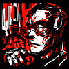
Gheeh... I don't know if I hate this or not... I was originally just going to slap some grey shading on the foreground drawing and leave it, but then I wanted to do the shield thing in detail, so I coloured the characters and put in a silly BG. The attacker looks crappy because in the drawing he was just a silhouette and I got lazy.
I kind of like the priest's pose and expression, though. /ramble
I kind of like the priest's pose and expression, though. /ramble
Category Artwork (Digital) / Fantasy
Species Unspecified / Any
Size 810 x 1024px
File Size 496.5 kB


yay der gesichtsausdruck des priesters ist wirklich klasse ^^ sehr schönes bild. Beeindruckt mich aufgrund der Dynamik und den Details in dem Hintergrund. Und es macht eigentlich nichts dass der Angreifer nicht so sauber gezeichnet aussieht ö-ö ich find einfach die wirkung maschinenmensch gegen mensch so toll ^-^
(hopes its okay that i wrote it in german ö____ö)
(hopes its okay that i wrote it in german ö____ö)
Thank you! I really need to find a way to make my thumbnails interesting - I'm always annoyed if I find a great piece in someone's favorites gallery and realise I've missed it because the thumb is too inconspicuous (not to say that this is a great piece, but I'd still like people to see it, obviously -_-).

Hmm... fair enough. I find that a snazzy line or a simple contrast of colors catches my attention. I'd just come up with something that you find interesting/amusing and post under that thumbnail. A personal sigil might work too.
Meh, who knows? I'm not a psychologist, just a philosopher. What do I know?
Meh, who knows? I'm not a psychologist, just a philosopher. What do I know?


Comments